All Features
Every PieMaster feature in one page, in plain language. Each entry says what it does and why it's useful.
Looking for the short pitch instead? See What is PieMaster?.
Menu Types
Pie Menus — Basic mode
Circular menu that opens at your cursor. Buttons sit around a fixed radius, so you flick a direction and you're done.
PieMaster does not use Blender's native pie system, so there is no 8-button limit and no restriction on what a slot can contain.
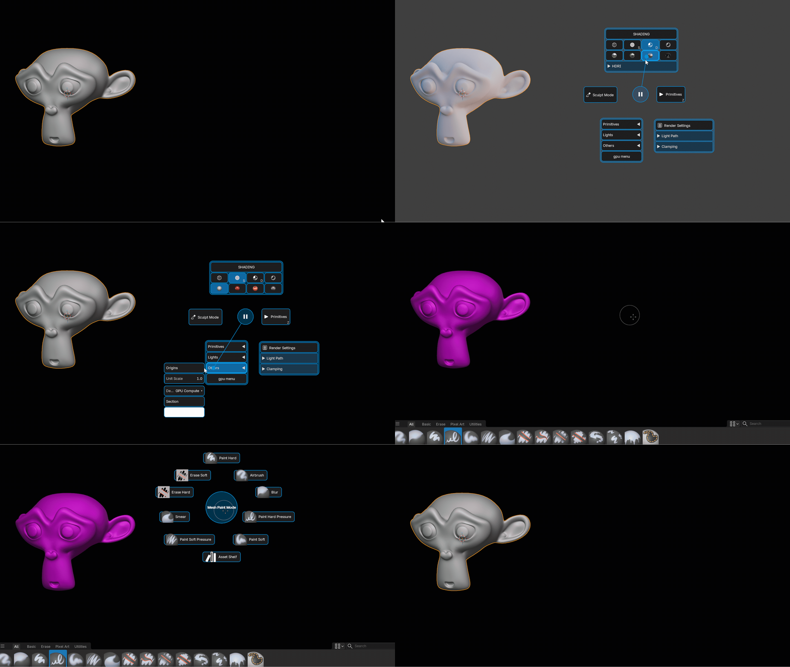
Pie Menus — Layout mode
The same pie, with free positioning. Drag any button anywhere and it stays there instead of snapping back to the radius. The center circle and trail are hidden, so you can build a custom-shaped HUD instead of a circle.
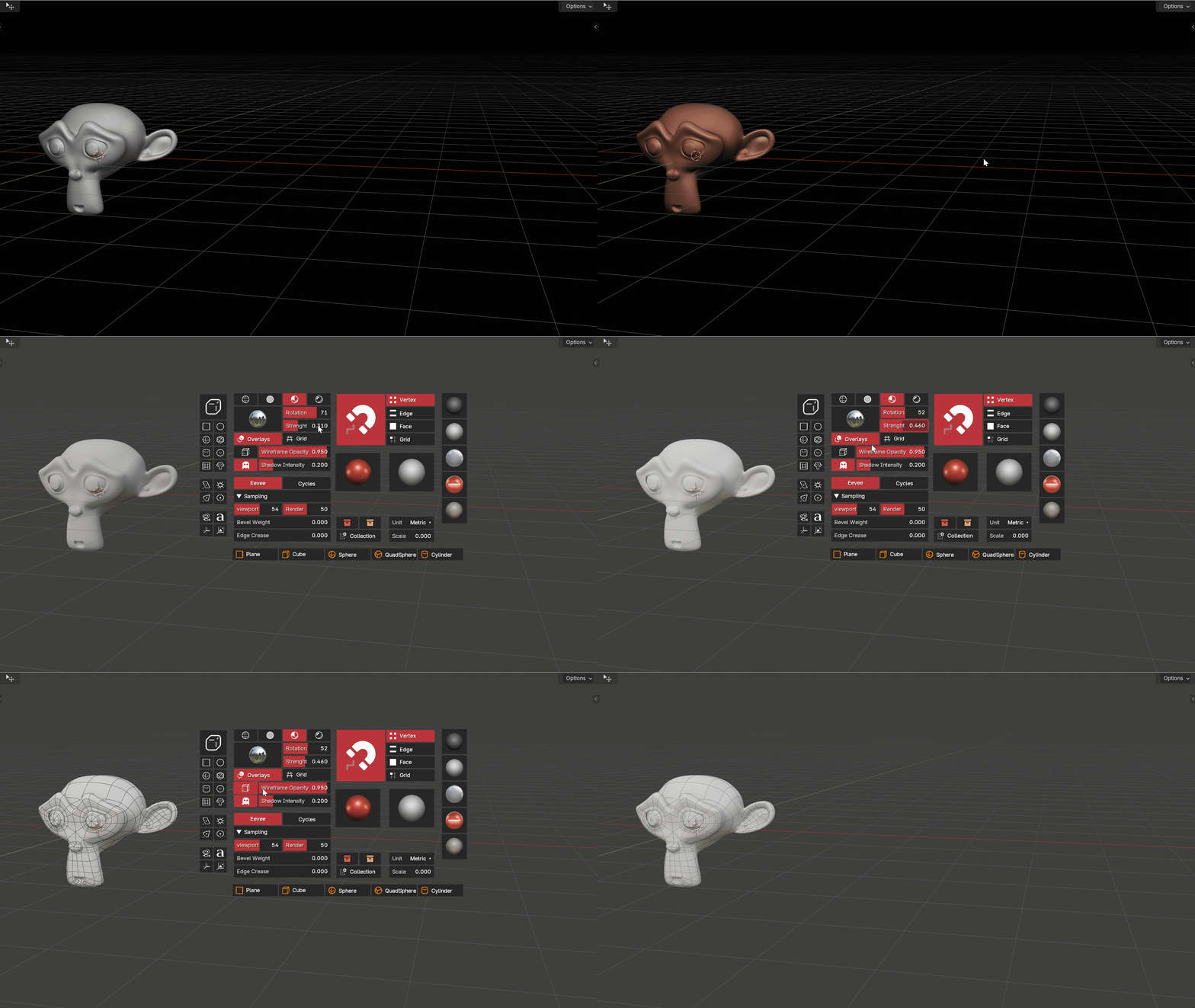
Simple Menus
A flat popup grid at your cursor. Best when you have many tools and would rather read labels than memorize directions.
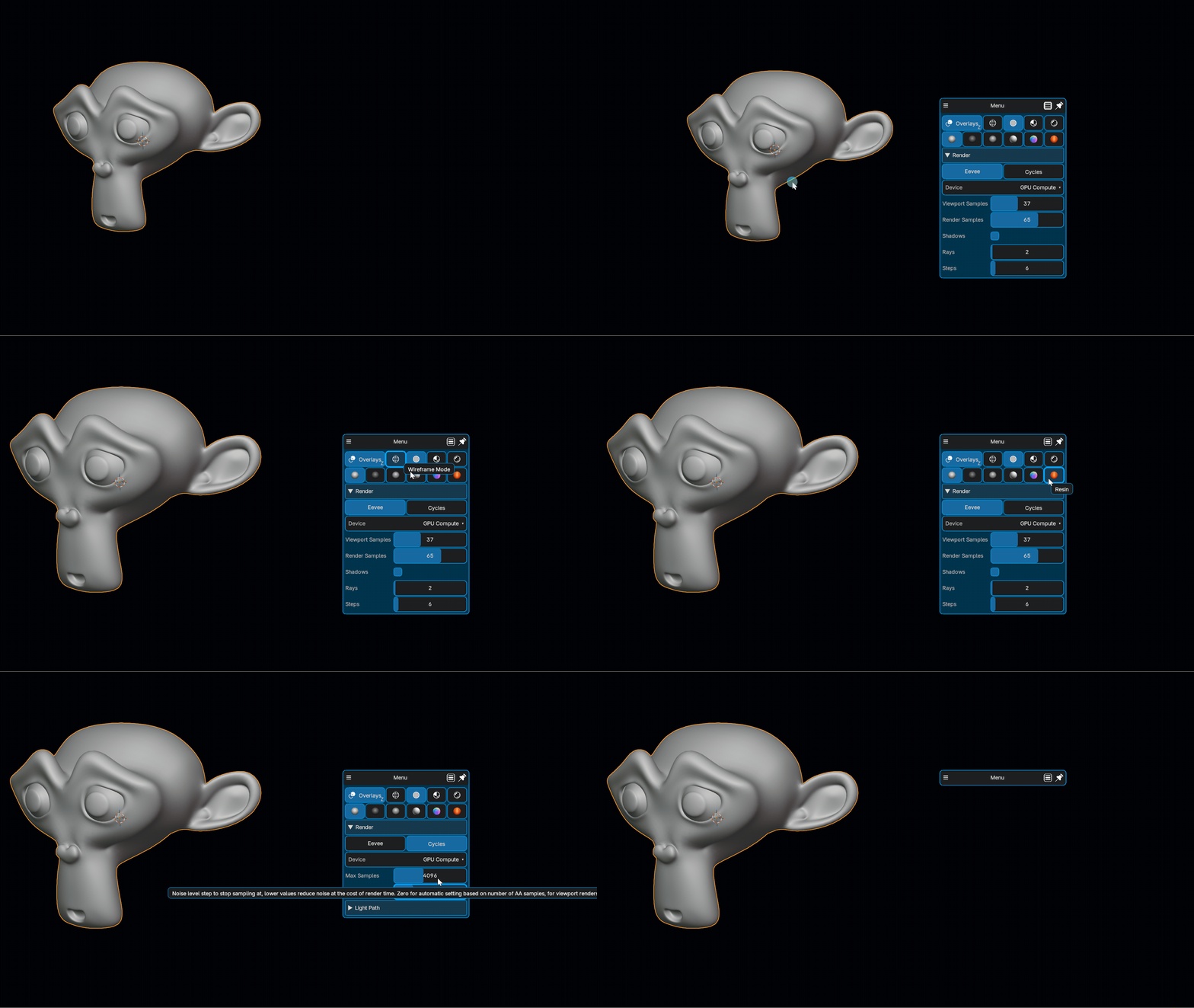
Layout Menus — Basic
A multi-column floating panel. Opens at the cursor, closes when you leave it. A full toolbar on demand, with independently resizable columns.

Layout Menus — Locked (consistent)
The same panel pinned at fixed screen coordinates, always visible — no shortcut needed. It becomes a permanent custom UI panel in your viewport, in any editor.
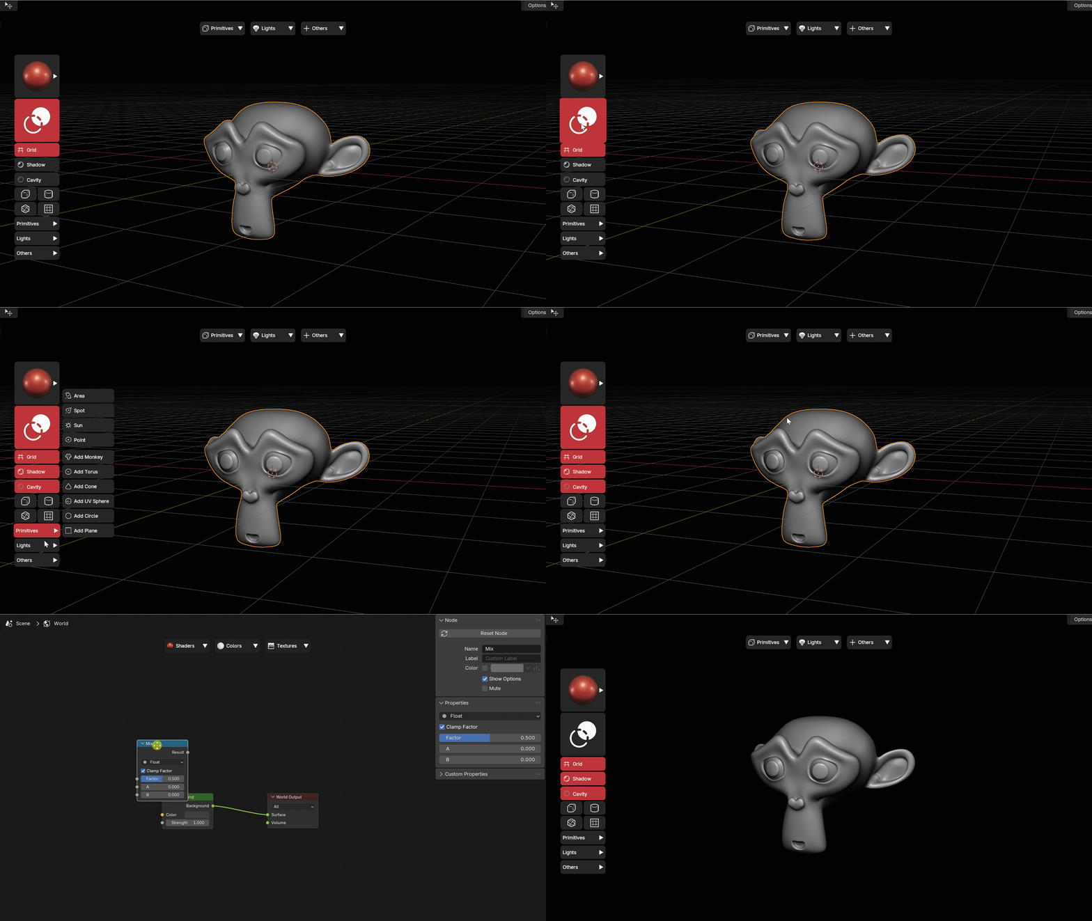
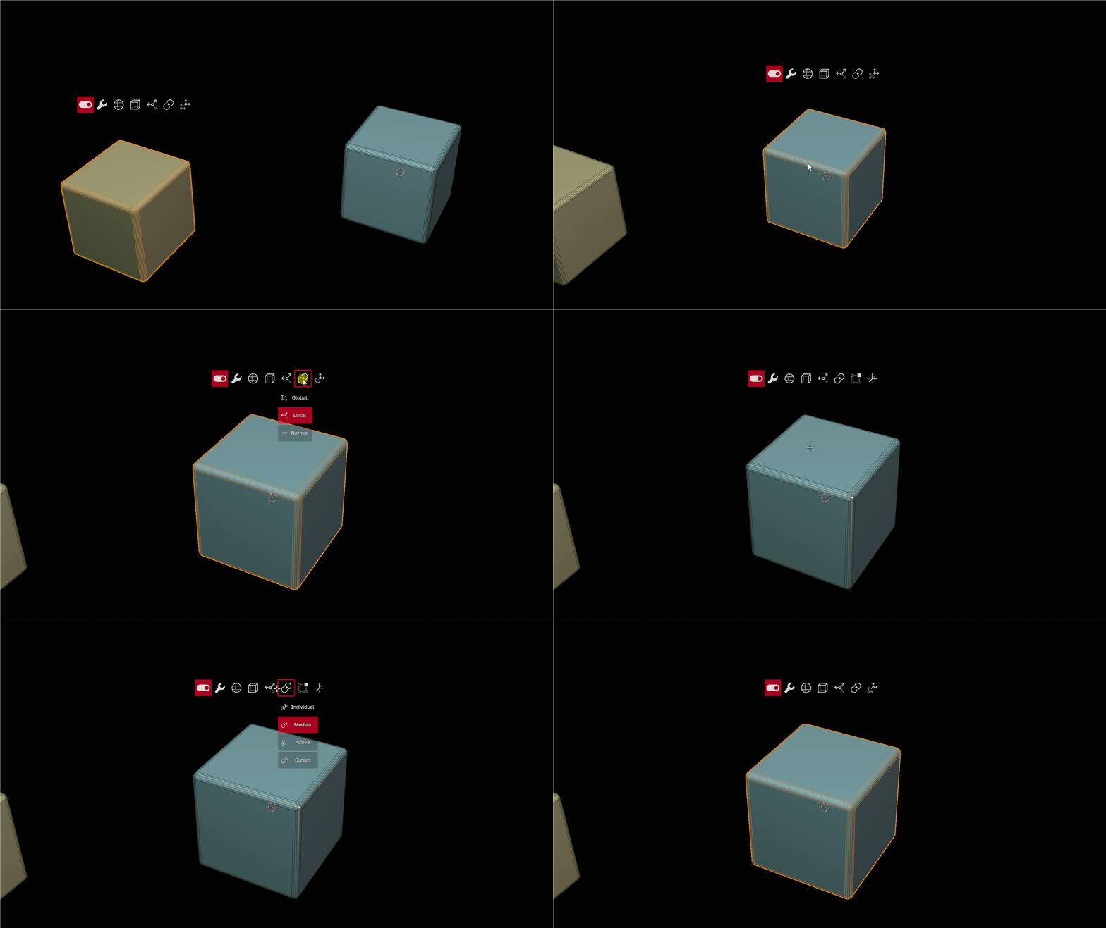
Object Menus (consistent)
A menu that will be placed on a selected object.
Nested Pie Menus
A pie that opens another pie. Build a whole tree: main pie → Modeling / Sculpt / UV sub-pies. Real nesting, unlimited depth, and the trigger key is inherited through every level so quick-action keeps working.

Nested Pie Menus with Chain Mode
Chain Mode keeps the pies you came through on screen, drawn as circles behind the current one — Maya style. Hovering one walks back to it, so a wrong turn deep in a nested system costs a move, not a reopen.
It is a per-menu setting, with a Chain Back Zone in the preferences setting how large those circles are to hit.

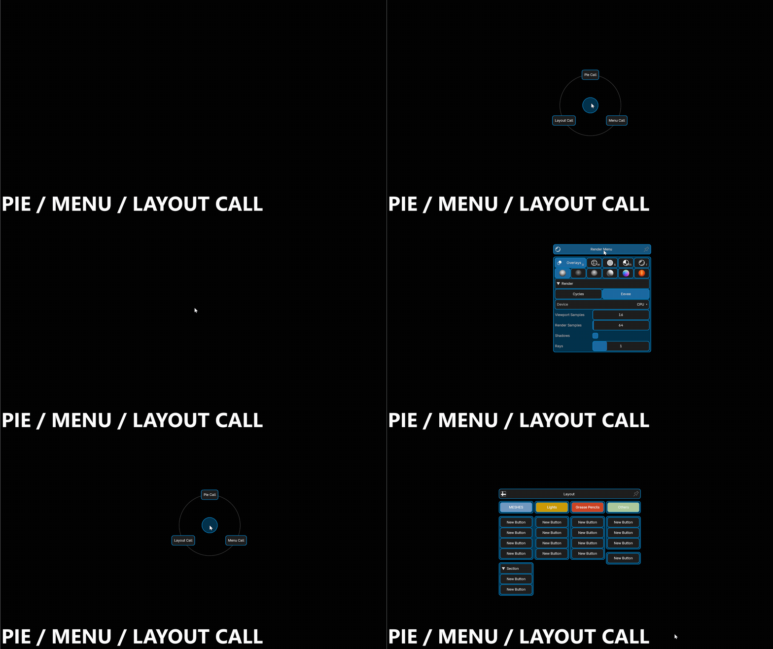
Pie Call / Menu Call / Layout Call buttons
Three button types that open another menu: a pie, a simple menu, or a layout panel.
Any menu can call any other menu, so you can mix all three types inside a single system.
The target picker lists the menus under their preset name, in the order of the menu list, with a preset filter and a menu type filter — so picking a target in a large preset is a scroll, not a search.
Shortcut Buttons
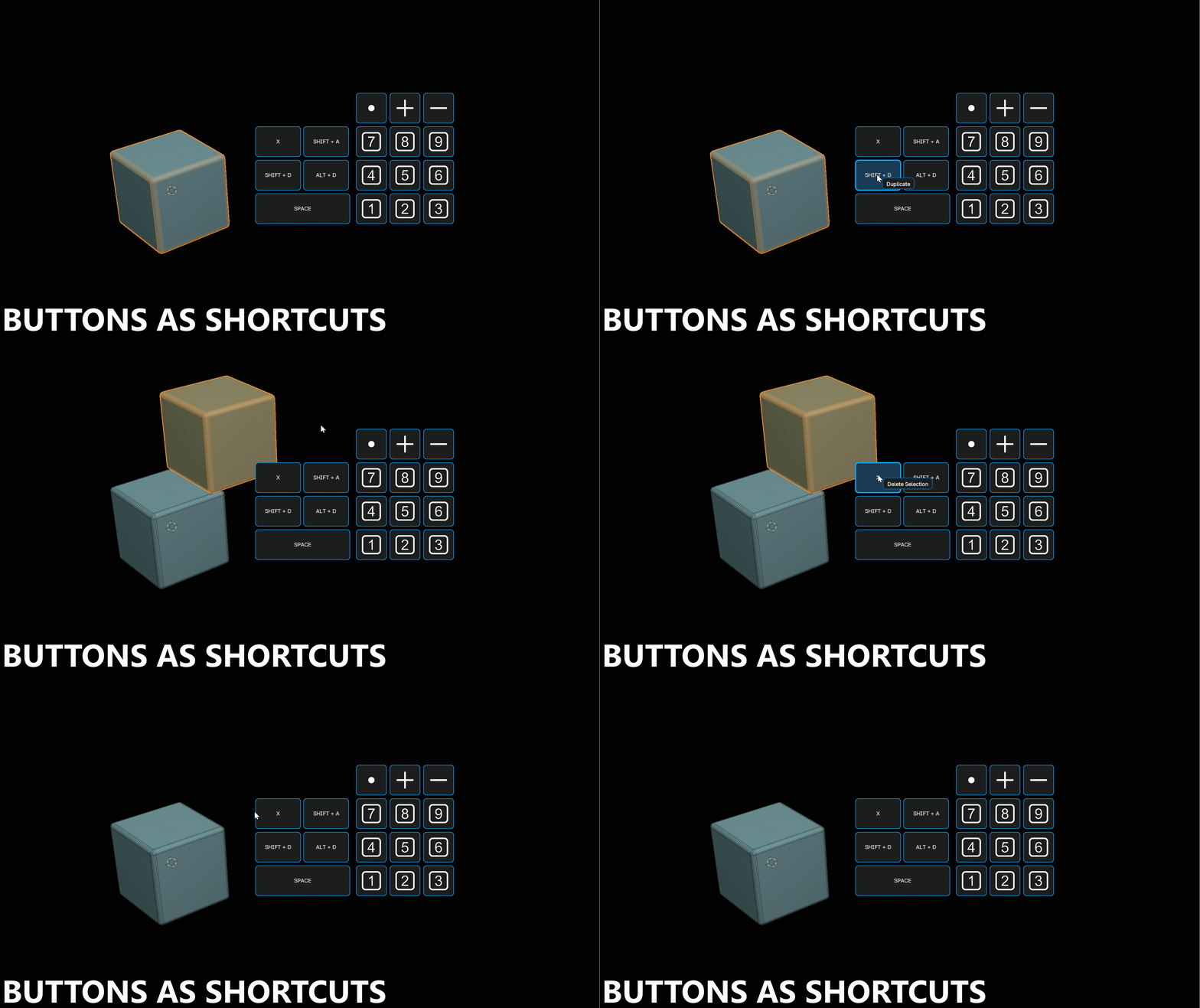
Shortcut buttons
A button that fires an existing Blender keyboard shortcut. Put any key combination on a clickable button — no operator hunting, no Python. Limited to Windows
Shortcut type
Choose which event the button reproduces:
| Event | Meaning |
|---|---|
| Press | Key press |
| Release | Key release |
| Click | Press + release |
| Double Click | Double click |
| Click Drag | Click and drag, with a drag direction (Any, N, NE, E, SE, S, SW, W, NW) |
A Held Key modifier is also available, so even complex Blender bindings are reproduced exactly.
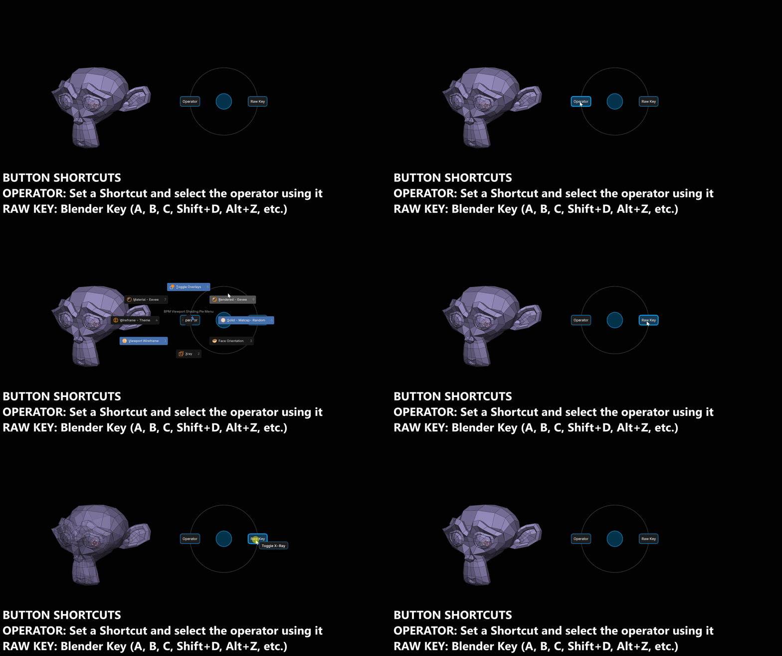
Shortcut mode — Operator vs Raw Key
| Mode | What it does |
|---|---|
| Operator | Finds the operator bound to that key in the current context and calls it. Works for anything a keymap can reach, and lets you pin one binding when several share the key. |
| Raw Key | Sends a real key event to the operating system. The only way to reach keys with no operator behind them (ESC, arrows, Return). Windows and X11 only — falls back to Operator mode elsewhere. |
Raw Key reaches the mouse as well: left, right, middle, the side buttons and the wheel, sent at the cursor.
Button hotkeys — sequences and alternates
Any button in an open menu can be fired from the keyboard, and a hotkey is not limited to one key:
| Written | Meaning |
|---|---|
a |
one key |
az |
a sequence — press a then z |
az, z, f2 |
alternates — any of them fires the button |
Numpad keys are supported, and a button with no label can carry a hotkey too. Menus opened by a shortcut are marked with a K icon in the menu list, so you can see at a glance which ones are bound.

Gestures
Draw a shape instead of pressing another key
A gesture is a shape drawn with the mouse while a shortcut is held, on a 3x3 grid of dots — the Android unlock pattern, applied to menus.
The grid is numbered like the numpad, and the cursor sits on the center dot when the drawing starts:
A gesture is written as the dots it goes over. 5123 starts at the center, goes down-left, then right twice.
| Written | Read as |
|---|---|
5123 |
the four dots, in order |
5-1-2-3 |
the same — separators are ignored |
513 |
the same — a straight run fills in the dots it crosses |
123 |
the same — a missing leading 5 is added for you |
525 |
allowed — a dot may repeat, just never twice in a row |

One shortcut, many menus
Every gesture on the same key combination shares a single Blender keymap entry — the shape you draw decides which menu opens. Ten menus on Ctrl+drag cost one shortcut, not ten.
That is the reason to use gestures at all: instead of hunting for a free key combination for every new menu, you keep one and give each menu a shape.
Where a gesture is set
| Place | What it binds |
|---|---|
| Keymap tab of a menu | the menu opens when that gesture is drawn on its shortcut |
| Global Shortcut of a button | the button fires from anywhere, after its gesture |
| Preview-Edit popup | the same binding, edited from the live menu |
The binding is plain fields — key, modifiers, held key, then the gesture — with the shape drawn beside them as a preview. Clear Gesture removes the shape and leaves the shortcut alone.
A gesture binding is always a Click Drag: the drawing is the drag, so there is no Event or Direction to choose.
How the drawing is read
Nothing is drawn on screen to aim at, so PieMaster reads the movement, not the position. From the dot the cursor is on, once you pull about 70% of a step away, the direction is quantised into one of eight sectors and the grid moves one dot that way.
A diagonal pull lands on the diagonal dot instead of clipping the corner beside it, and arcing around a dot on the way still reads as the straight run.
The size of the drawing is not free: one step is the Gesture Grid Size preference (100 px by default), so a stroke drawn twice too large reads as an extra dot wherever the grid has room for one. Overshoot past the edges is absorbed.
Options
| Option | What it does |
|---|---|
| Gesture Grid Size | distance between two dots, in pixels. Smaller is quicker to draw and easier to overshoot. Scales with the interface scale |
| Block the Click Under the Cursor | takes the mouse button the instant it goes down, so drawing over an object or a node no longer selects it. The cost is the plain click on that combination |
| Show Grid Dots | draws the nine dots while a gesture is being drawn, so the shape can be aimed at instead of guessed |
| Trace style | line color and width, dot color and radius, dot border color and width, grid dot color and size |
Toggle works on a gesture too: draw the same gesture again to close the menu. The bare key combination is left alone, since it is shared with every other gesture on those keys.
Seeing what is bound
The preset and menu lists carry a gesture badge, so a shape set on a button buried inside is visible from the outside.
Two menus sharing a shortcut with different gestures are not reported as duplicates — telling them apart is what the gesture is for. What is reported: two gestures on one key under different events, a gesture on a mouse button left on Press (it would fire before the drawing began), and a combination also bound without any gesture.
A gesture never draws in an editor where its menu or its button is hidden by a condition — the key is left to whatever else is bound to it.
Opening Behavior
Key Hold (Hold to Open)
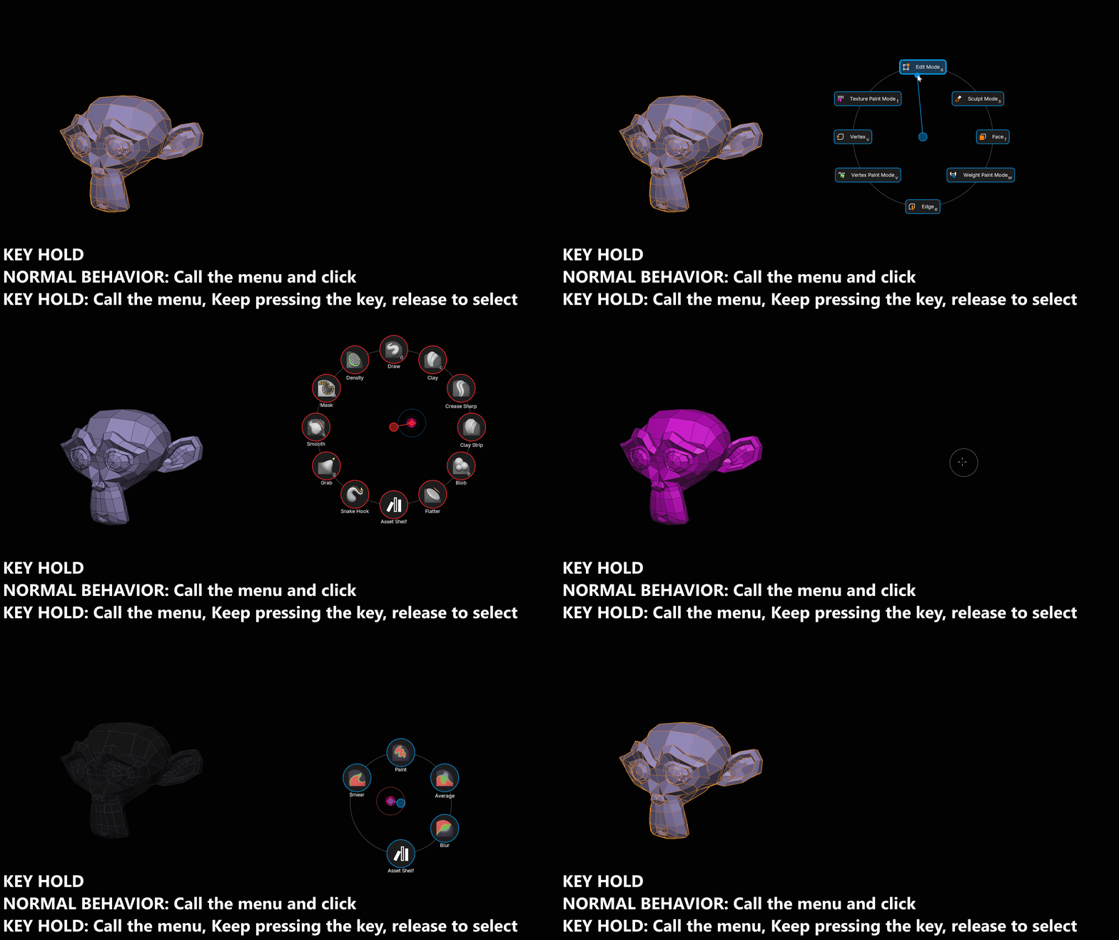
Hold the key and the menu opens. Go to the direction of a button, release the key, the button is selected.
The hold time is adjustable (default 0.2s). On this example, the button as a trigger (Key Hold) as Nested Pie Menu, if you just call an click, the button will set the mode, if you key hold and go on the button, it will activate the Trigger. It's a clever way to automatically fire another action.
Auto open on hover
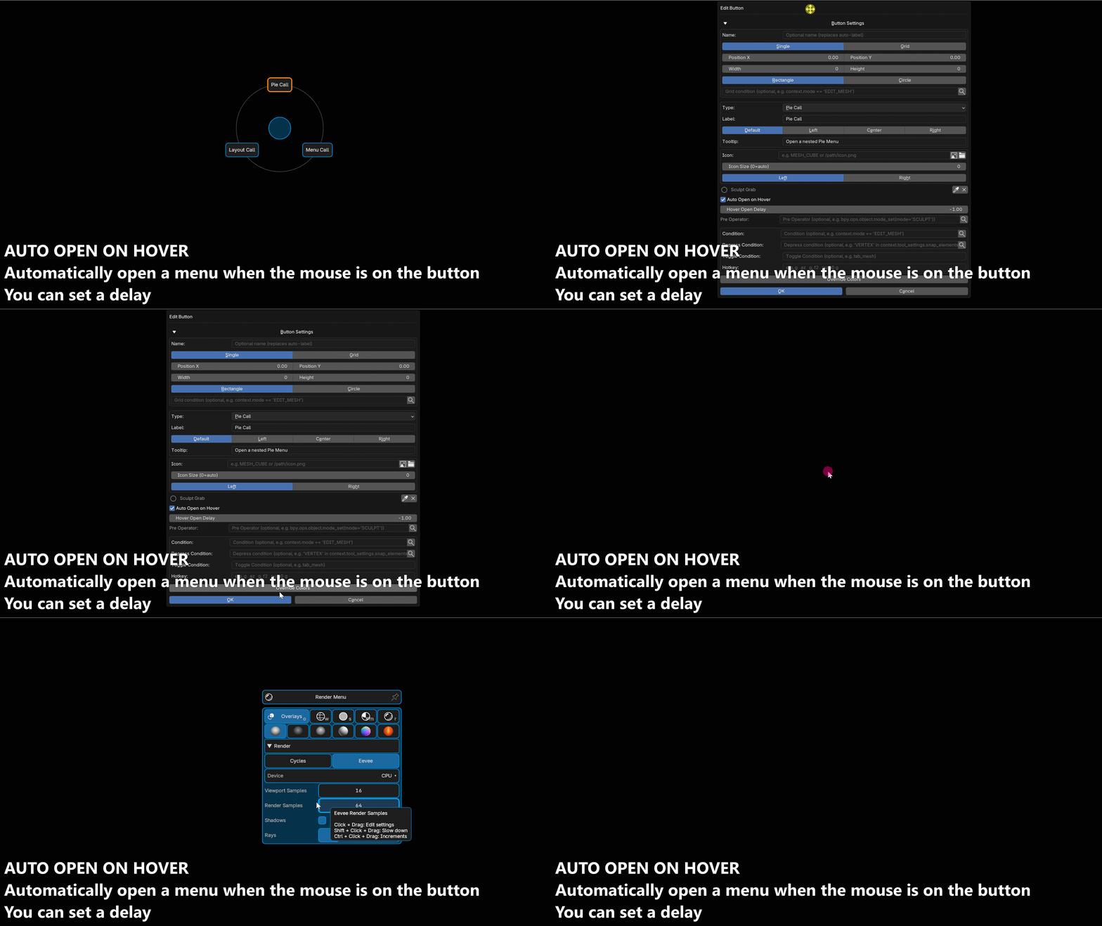
Pie Call, GPU Menu and Drawer buttons open just by hovering — no click. Moving toward a sub-pie opens it instantly, so navigating a nested system feels like one continuous gesture. You can add a delay (Default = -1)
Open on delay (Hover Open Delay)
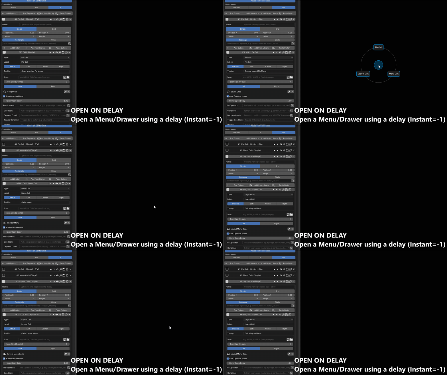
Sets how long the cursor must rest on a button before hover-open fires. 0 = instant, 0.2 = you can pass over a button without triggering it. Set globally, or per button.
Useful when using as a trigger variant
Operation 1: go in edit mode
Operation 2: call a pie menu when hovering the button and waiting a little
Auto Fire on Hover
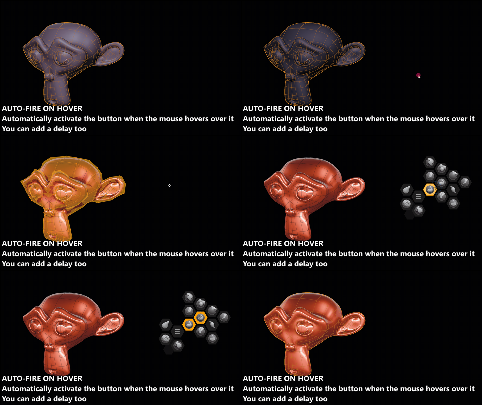
The same idea as auto open on hover for action buttons: the operator runs on hover, with no click at all. Off by default, since it runs the real action rather than just opening a menu.
Toggle Menus
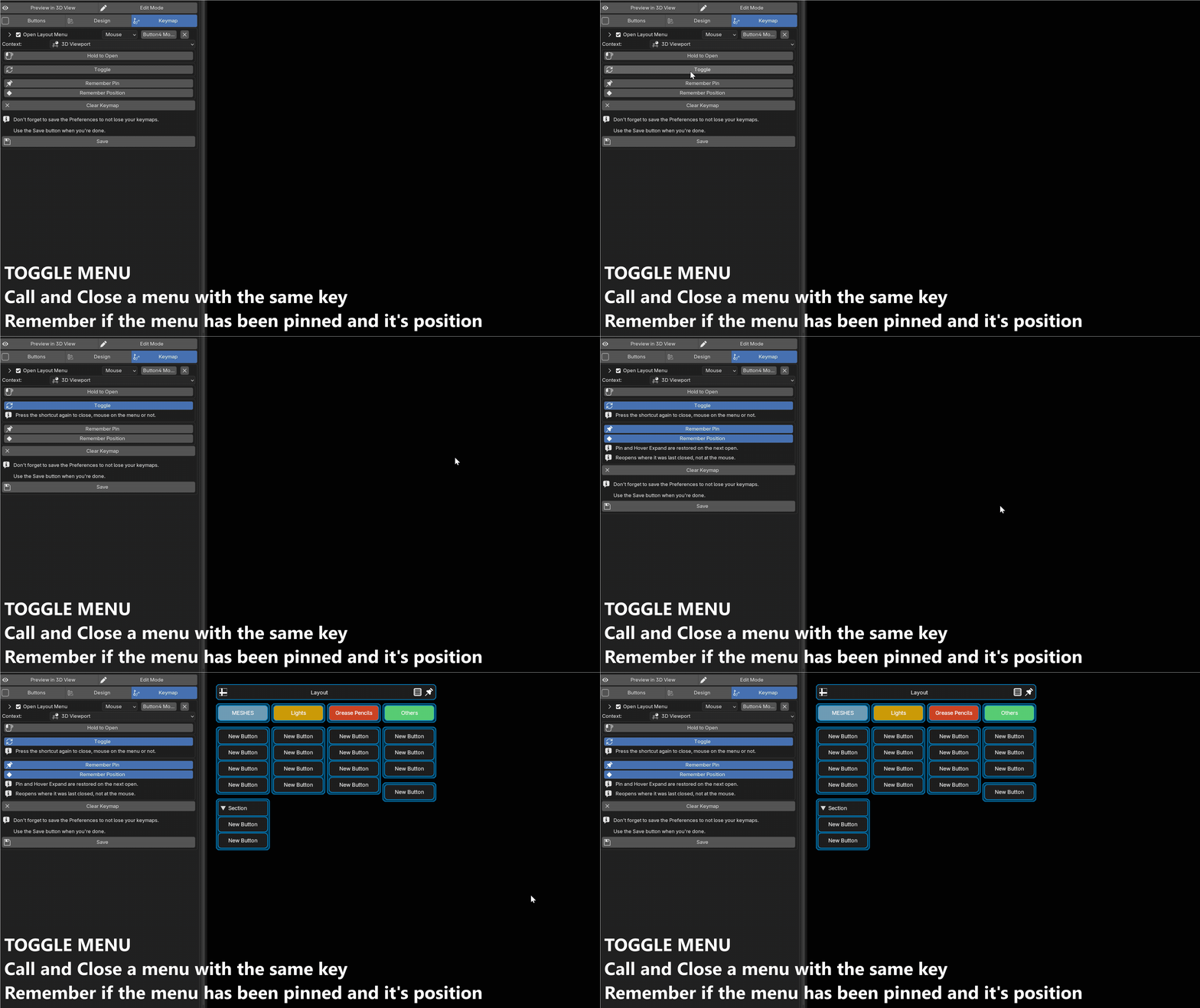
Press the shortcut again to close the menu, wherever the mouse is. No need to aim at the center or reach for ESC.
Unavailable together with Hold to Open, and ignored for a plain mouse button with no modifier.
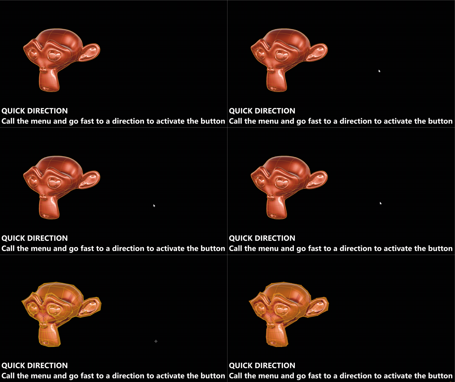
Quick Direction
Flick past a distance threshold and release the key — the button fires without clicking. Pure muscle memory, and the fastest way to use a pie.
The distance is adjustable, and it can be enabled for grid directions too.
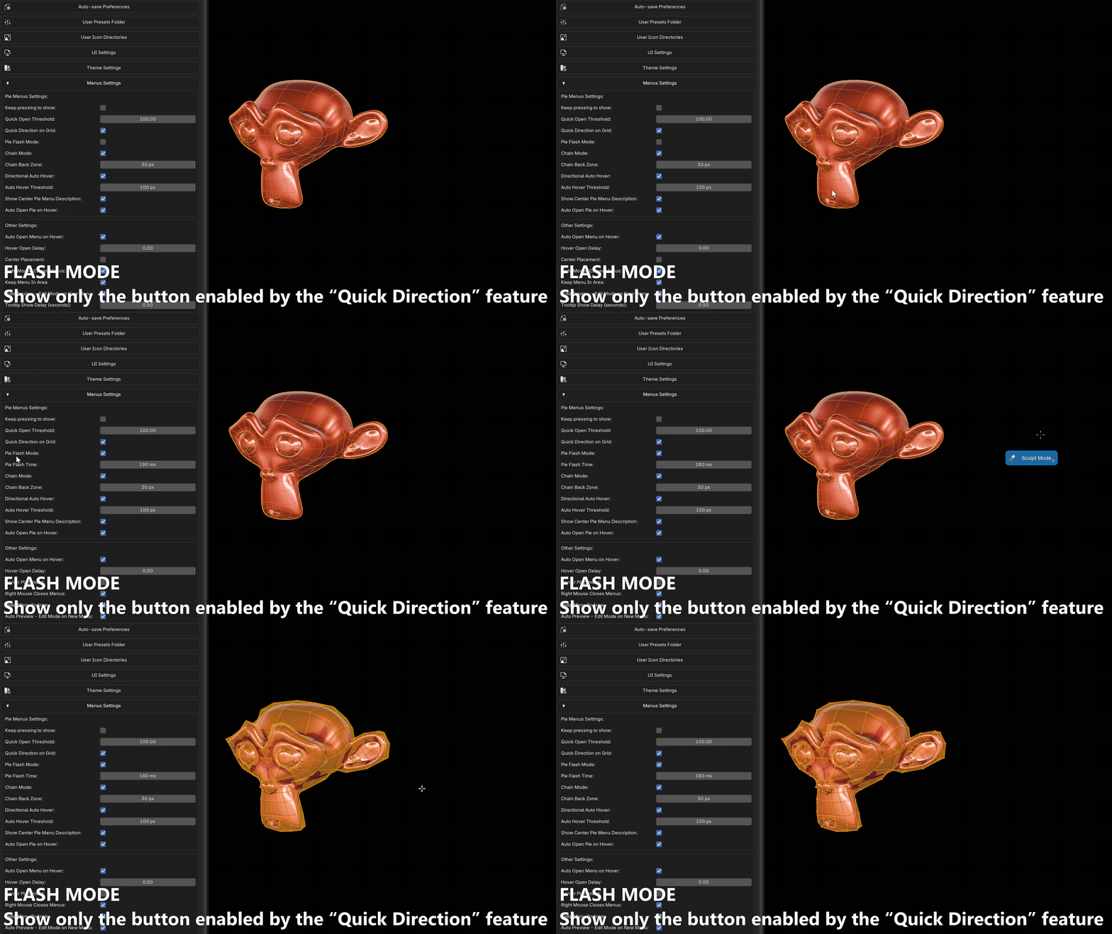
Pie Flash Mode
While Quick Direction is still armed the pie stays invisible and only the button you are flicking toward is drawn. Flick, release, done — you never see the full menu.
Hold instead of flicking and the whole pie appears as usual, so the same key serves beginners and muscle memory.
Flash Time sets how long the fired button stays on screen afterwards, so you can read what was activated (0 = off). The action always runs immediately; the flash never delays it.
Basic (radial) pies only — ignored in Layout mode and with Center Placement.
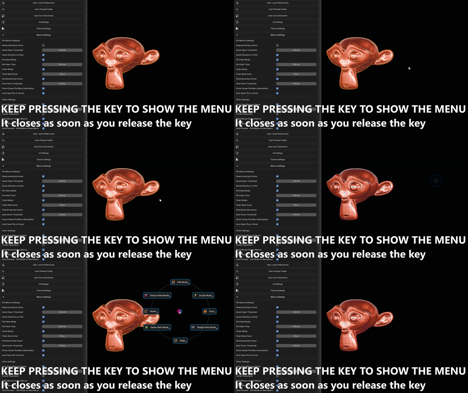
Spring Loaded
The menu lives only while the key is held. Release it and the highlighted button fires, then the menu is gone. Press, flick, release.
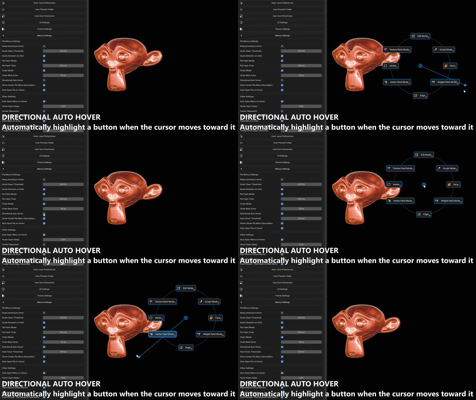
Directional Auto Hover
Highlights the nearest button in the direction you're moving, even if you overshoot it. Stops you missing buttons when moving fast.
An engage threshold controls how far the cursor must travel from the center first, so buttons near the center don't fire too early. Automatically disabled for grid layouts.
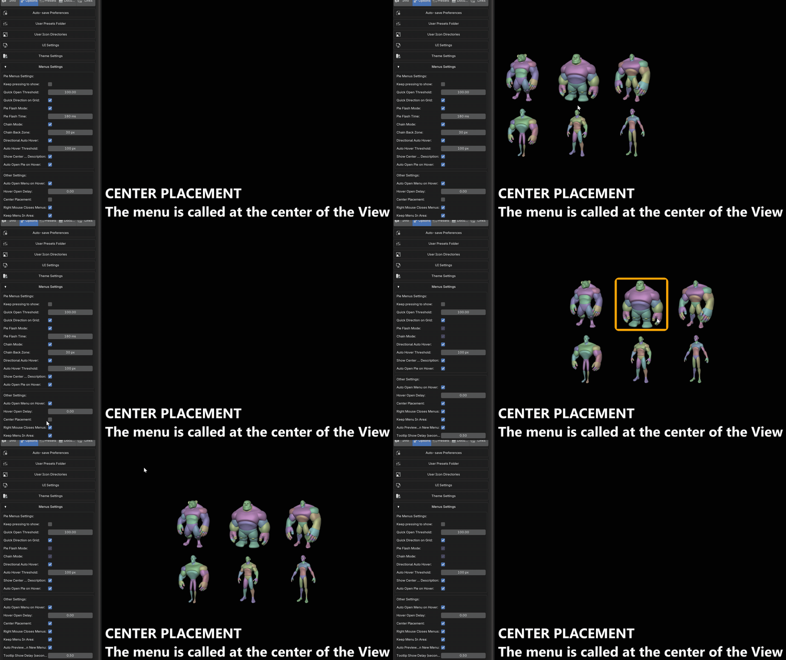
Center Placement
Opens every menu at the center of the editor instead of at the cursor. Useful on large screens, or when your cursor position varies too much.
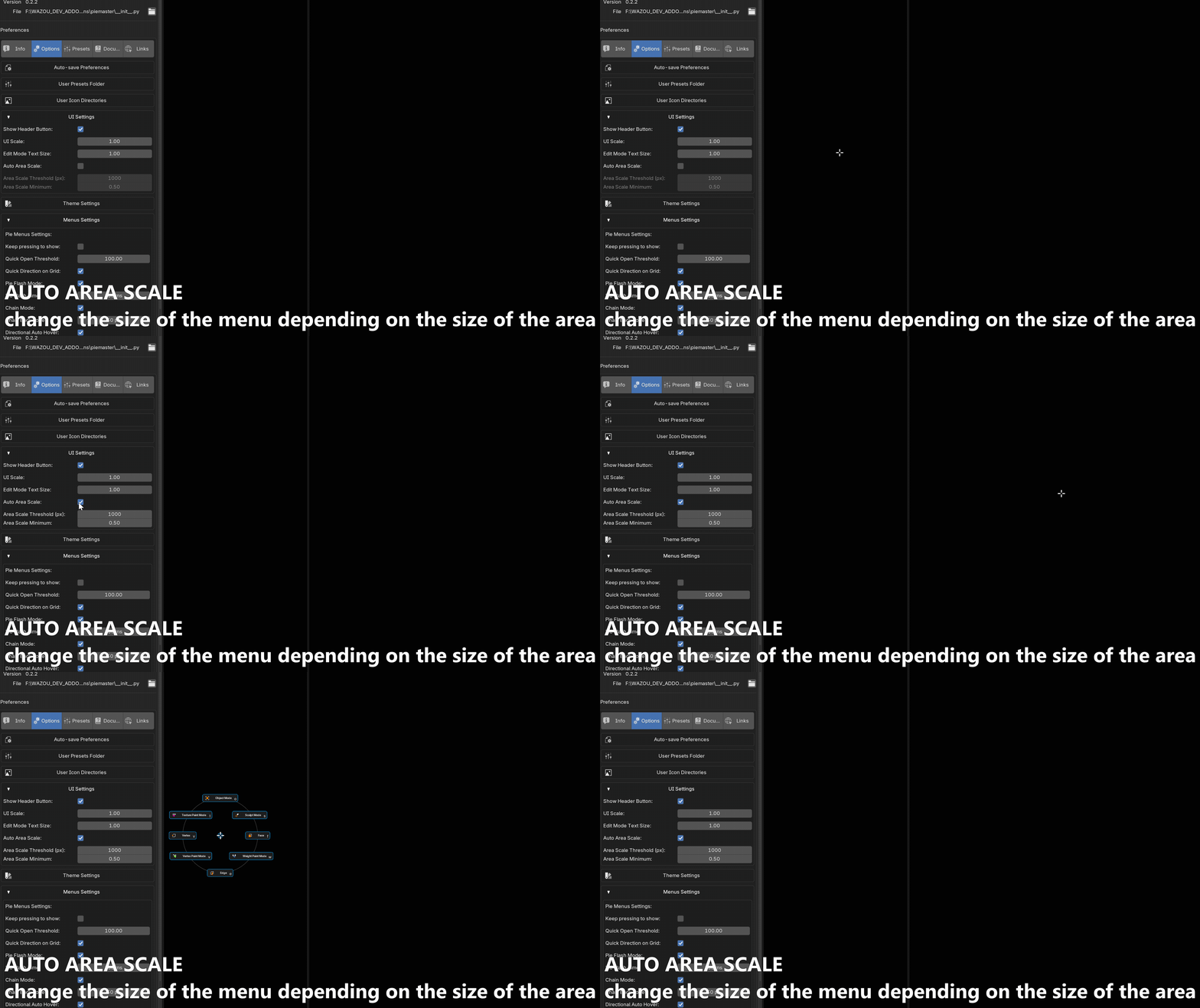
Auto Area Scale
The menu shrinks automatically when it opens in a small editor, so it never overflows a narrow panel. Threshold and minimum size are adjustable.
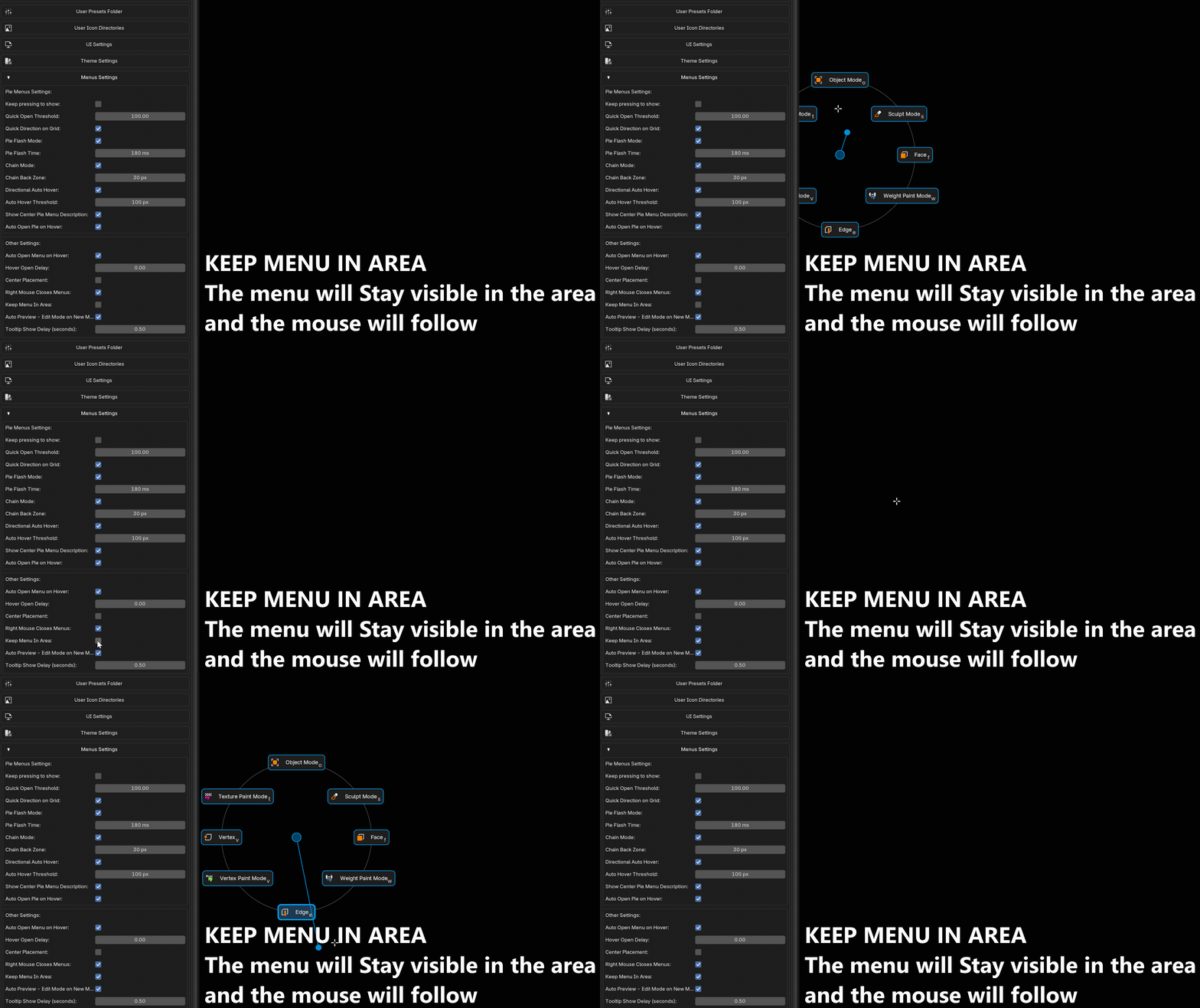
Keep Menu In Area
Nudges the menu inward so it stays fully inside the editor, keeping a margin from the edges. Open near a corner and nothing gets clipped.
Locked menus always stay in view, and this is ignored for pies when Center Placement is on.
Button Logic
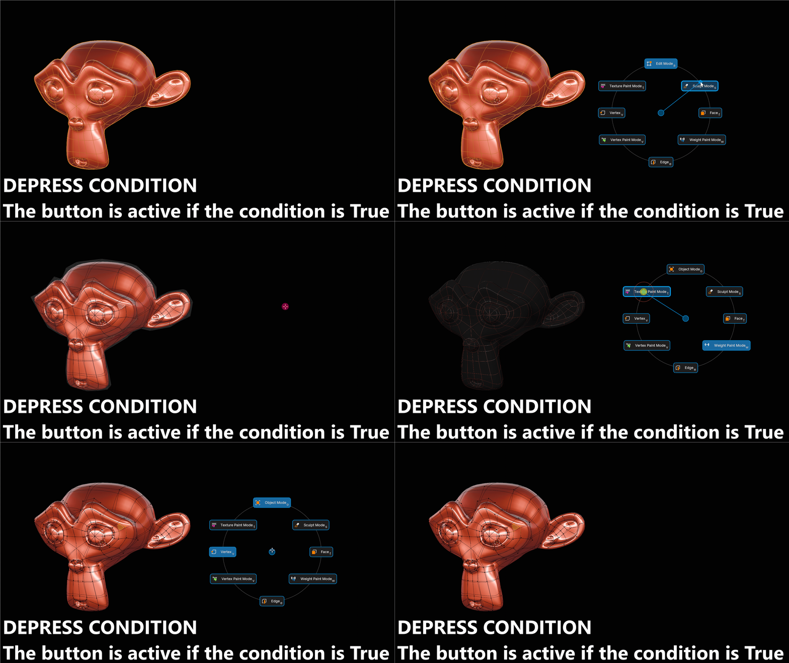
Depress Condition
A Python one-liner that draws the button pressed and highlighted when it's true. Your menu shows Blender's actual state at a glance — active snap mode, active tool, enabled overlay.
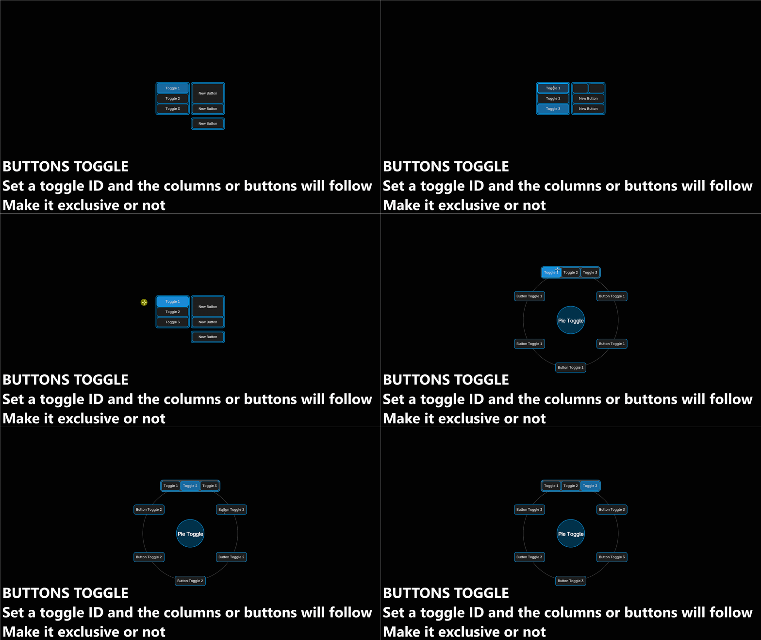
Toggle buttons and Toggle Condition
A button that shows or hides other buttons — and whole columns.
Give the toggle an ID, tag other items with the same Toggle Condition, and one click swaps the menu's entire content: tabs, modes, or workspaces inside a single menu.
Exclusive mode allows only one toggle active at a time; disable it to keep several active together. A toggle can also start active when Blender launches.
Trigger Variants
Several actions on one button, chosen by how you interact with it: Shift+click, Ctrl+click, Alt+click, drag up/down/left/right, key hold — over 40 combinations.
One "Shade Smooth" button that does Shade Flat on Shift+click, instead of two buttons.

Conditions (menu and button level)
Show a button only in Edit Mode, only with a mesh selected, only in Sculpt Mode. Menu-level conditions stop the menu from opening at all, so the same key can give a different menu per context.
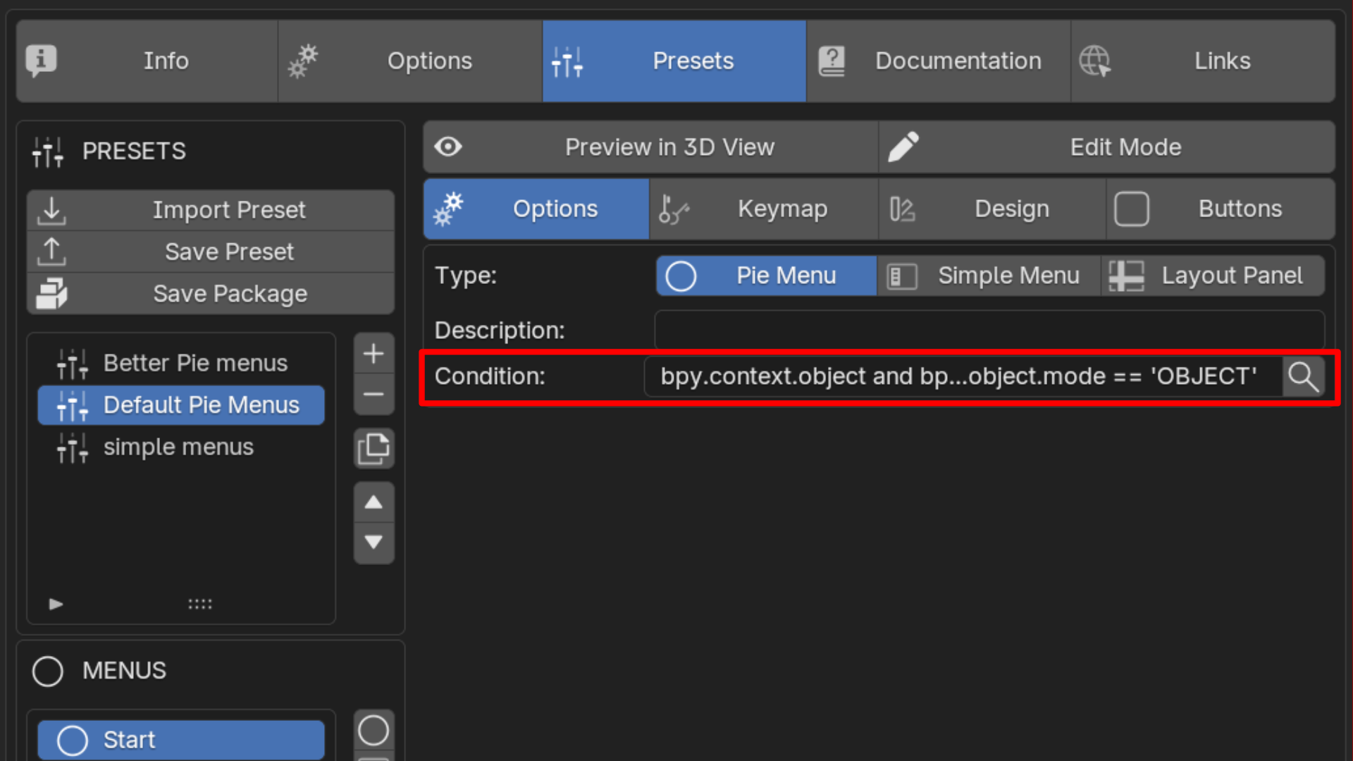
Conditions are re-checked live while a menu is on screen, not only when it opens: a LOCKED or Object menu hides itself the moment its condition stops being true, and comes back when it is true again.
Helpers are provided so an expression stays valid wherever it is evaluated — view3d(), perspective(), in_camera(), mode(), has_area(). They find the real 3D view for you, which context.space_data cannot always do.
getattr and hasattr are also available, in conditions, dynamic labels and dynamic icons alike.
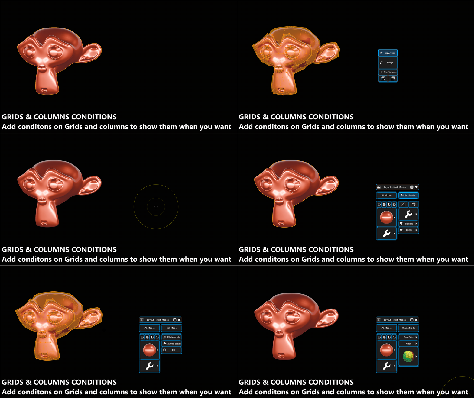
Group Conditions — hide many buttons at once
One expression, a whole block gone. No need to repeat the same condition on every button.
| Where | What it hides |
|---|---|
| Grid / pie slot | the slot and every button it holds (the other slots keep their angle) |
| Layout column | the column and all its buttons; the remaining columns close the gap |
| Section | the section header and every button under it |
A hidden container never evaluates the conditions of the buttons inside it — one check instead of one per button, so a large conditional menu stays fast.
Grid and column settings (name, width, columns, toggle condition, condition) are editable straight from the Preview-Edit button popup, not just in Preferences.
Dynamic Icons & Dynamic Labels
Dynamic Icons
The icon of a button changes with the scene, the same way a Depress Condition changes its look.
Three ways to write it:
# Rules — first true expression wins
C.tool_settings.use_snap = snap_on, not C.tool_settings.use_snap = snap_off

# Switch on one property value
C.scene.tool_settings.transform_pivot_point: MEDIAN_POINT = pivot_median, CURSOR = pivot_cursor

# Bare property path — PieMaster asks Blender which icon matches the value
C.scene.tool_settings.transform_pivot_point
Available on Operator, Property, Python, Label, Drawer and GPU Menu buttons. Results are cached, so a dynamic icon costs nothing per frame.
Dynamic Labels
Labels are not just text. They can display live values, span several lines, and mix sizes and colors inside a single button.
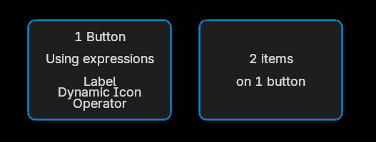
| Code | Effect |
|---|---|
{expr} |
shows the value — Res {C.scene.render.resolution_x} |
{expr:spec} |
with a Python format spec |
| bare property path | auto-displayed as a value |
\n |
line break |
\l \c \r |
align that line left / center / right |
\sNN |
font size of that line, in % (\s150 = 1.5×) |
\xNN |
spacing above that line, in % |
(text;(r,g,b,a)) |
a colored run inside a line |
Angles and rotations are converted to degrees automatically.
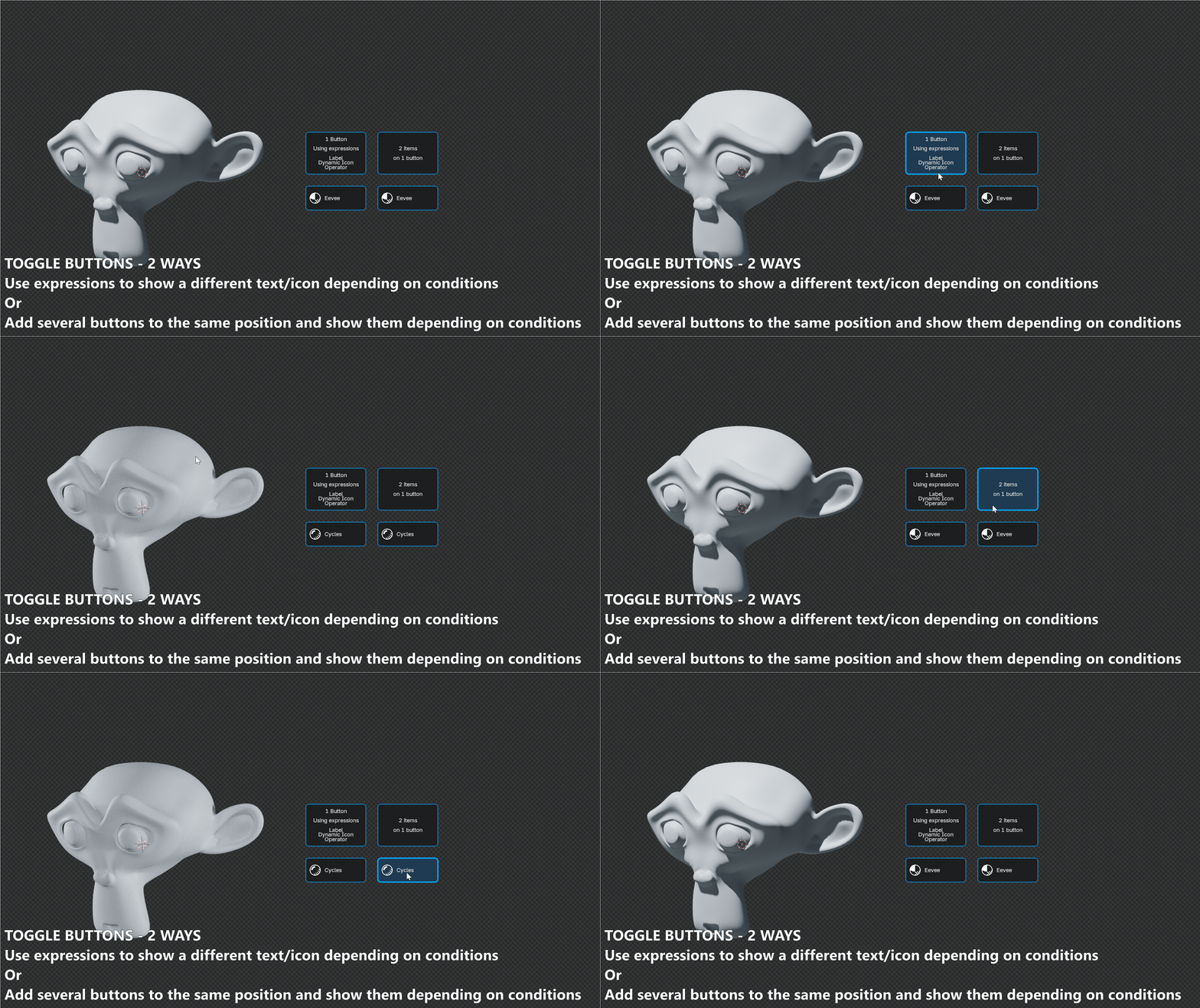
Combine Dynamic Icon & Label to make toggle buttons
You have different ways to show buttons, add a button with 2 items, each item will be visible depending on a condition. Or use expression like Dynamic Label and Dynamic Icon to use one button.
# Toggle Eevee & Cycles

# Label
{'Cycles' if C.scene.render.engine == 'CYCLES' else 'Eevee'}

# Dynamic Icon
C.scene.render.engine: CYCLES = shading_rendered, BLENDER_EEVEE = shading_texture

# Operator
bpy.context.scene.render.engine = 'BLENDER_EEVEE' if bpy.context.scene.render.engine == 'CYCLES' else 'CYCLES'
Tooltips
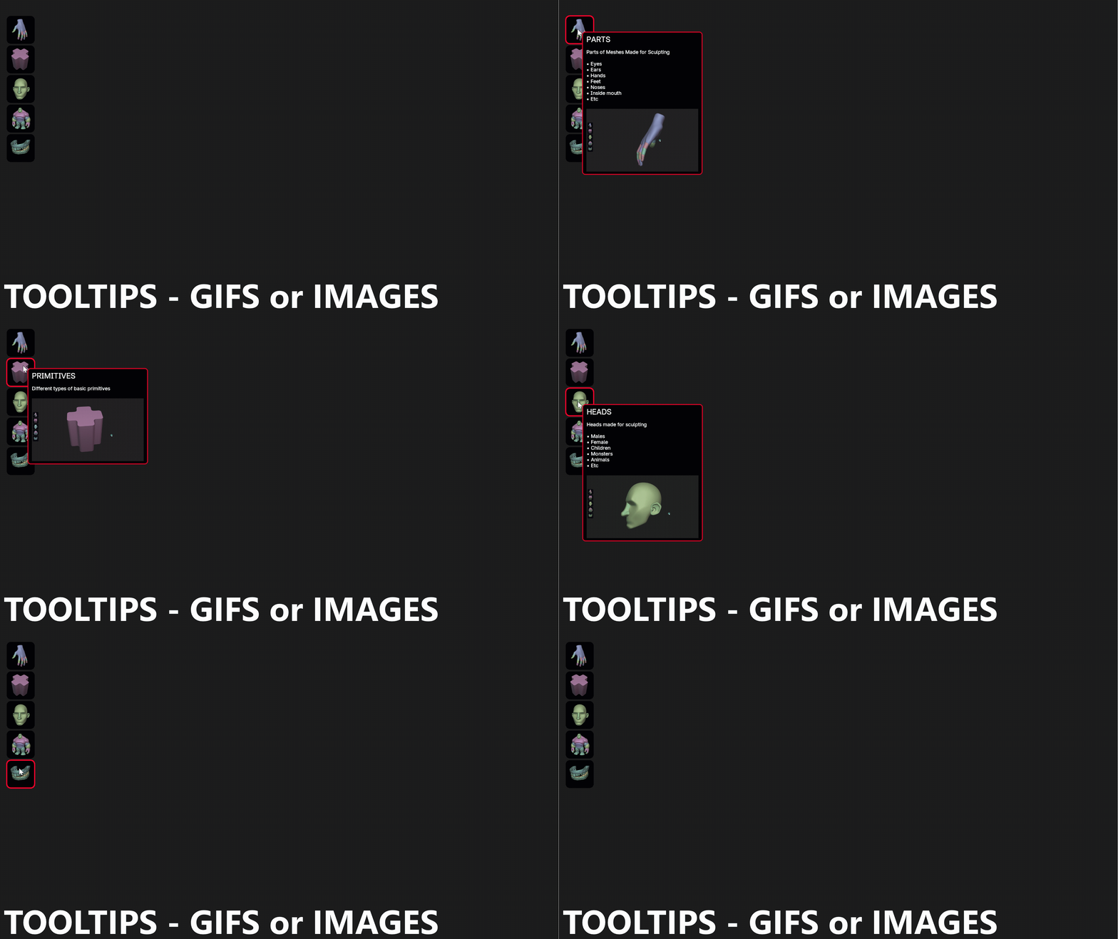
Same as the labels, tooltips can use multilines, and the other options (\l, \s, \x, etc.)
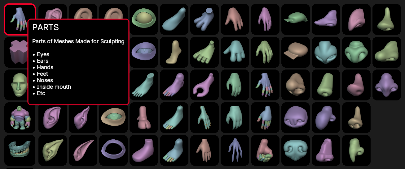
You can make them dynamic and also use properties!
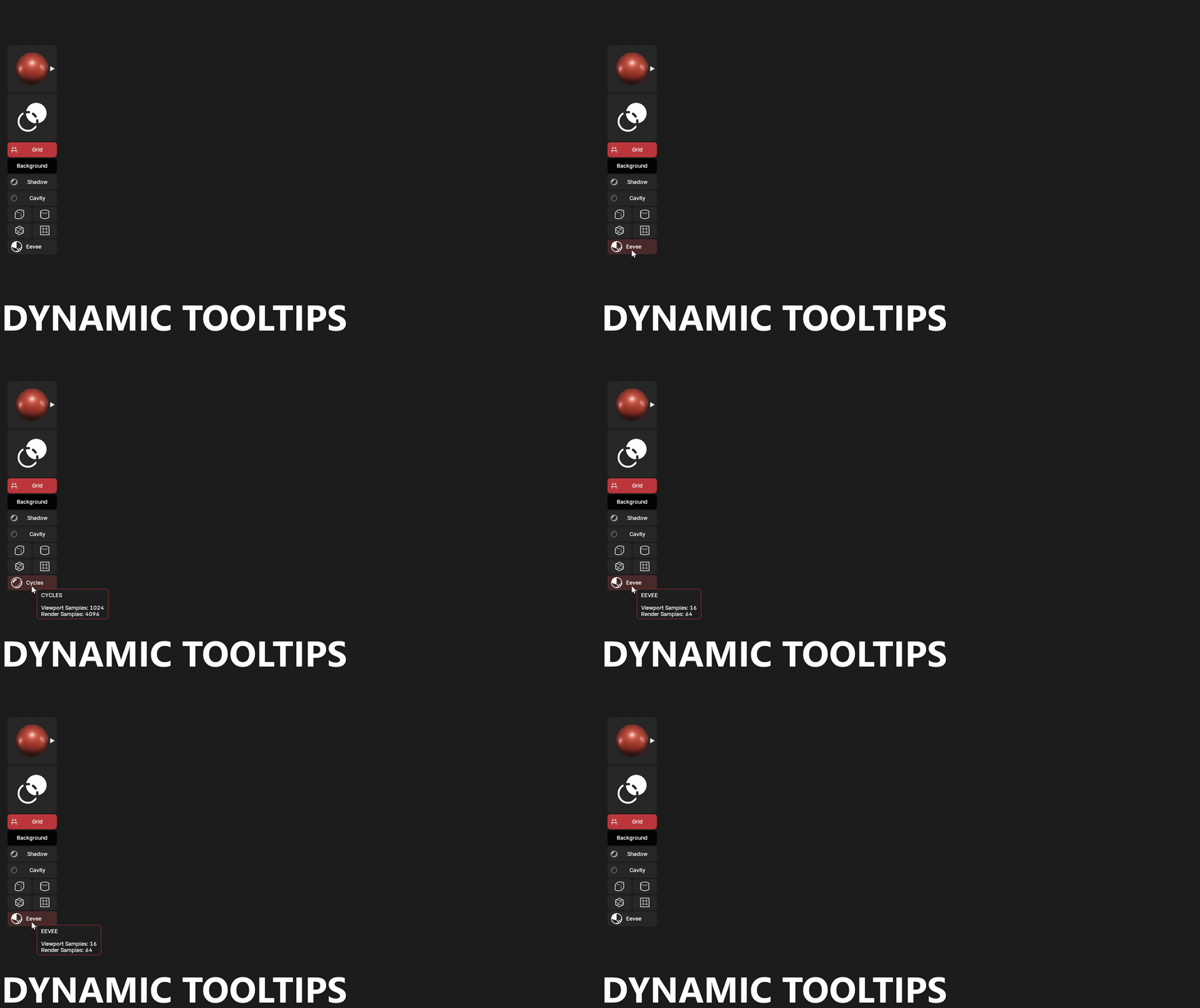
{'CYCLES' if C.scene.render.engine=='CYCLES' else 'EEVEE'}\n\nViewport Samples: {C.scene.cycles.preview_samples if C.scene.render.engine=='CYCLES' else C.scene.eevee.taa_samples}\nRender Samples: {C.scene.cycles.samples if C.scene.render.engine=='CYCLES' else C.scene.eevee.taa_render_samples}
You can also add picture and/or GIFS You need to take into account that for the GIFS, the addon will convert them into single images and read them one after one other to make the animation. It can take some time to show properly for the first time!
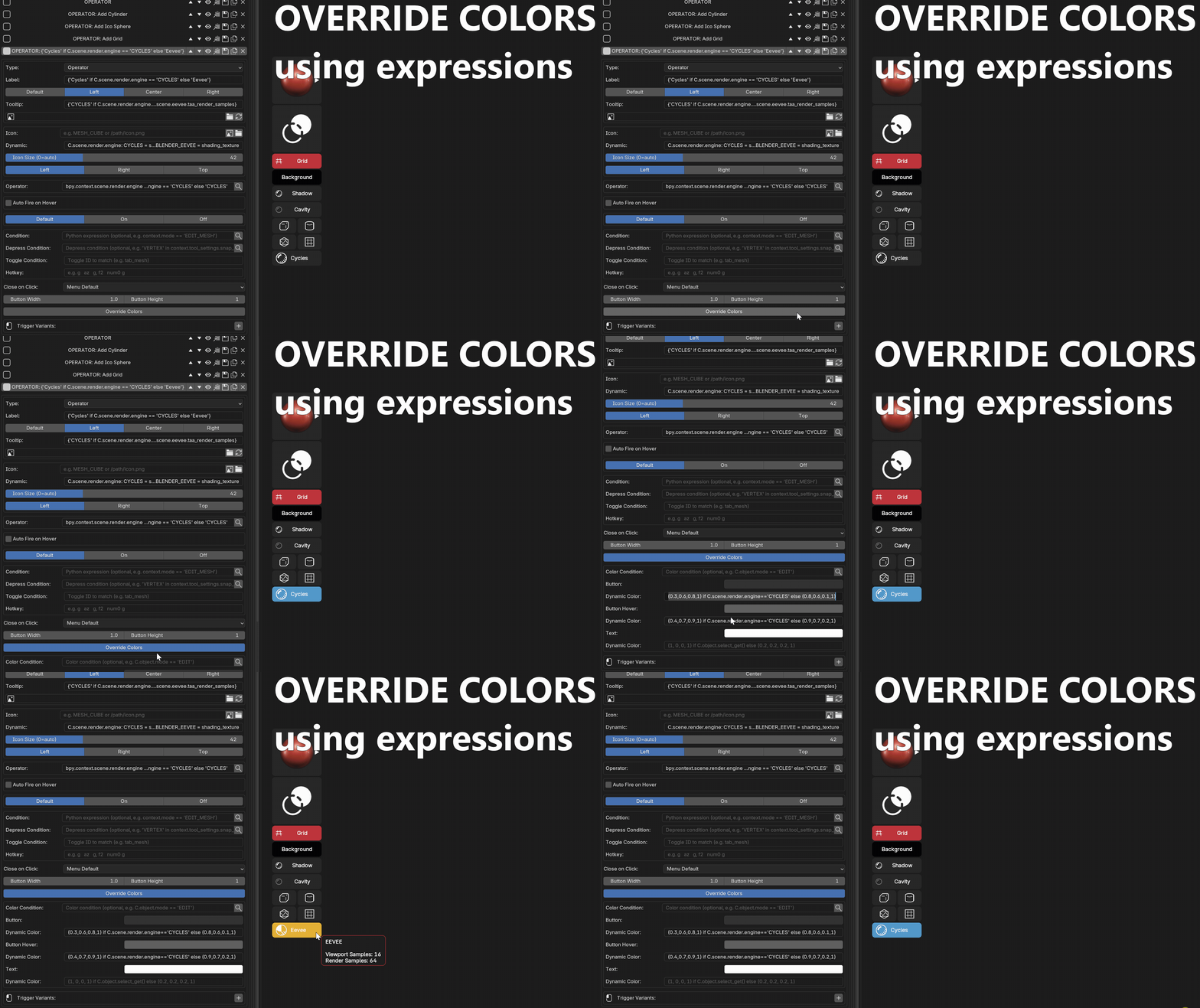
Override Button Colors
Add a color to a button.

You can add conditions to change the color of the button!
#Button
(0.3,0.6,0.8,1) if C.scene.render.engine=='CYCLES' else (0.8,0.6,0.1,1)

#Button Hover
(0.4,0.7,0.9,1) if C.scene.render.engine=='CYCLES' else (0.9,0.7,0.2,1)
This code will change the color of the button if we are using Cycles as render engine
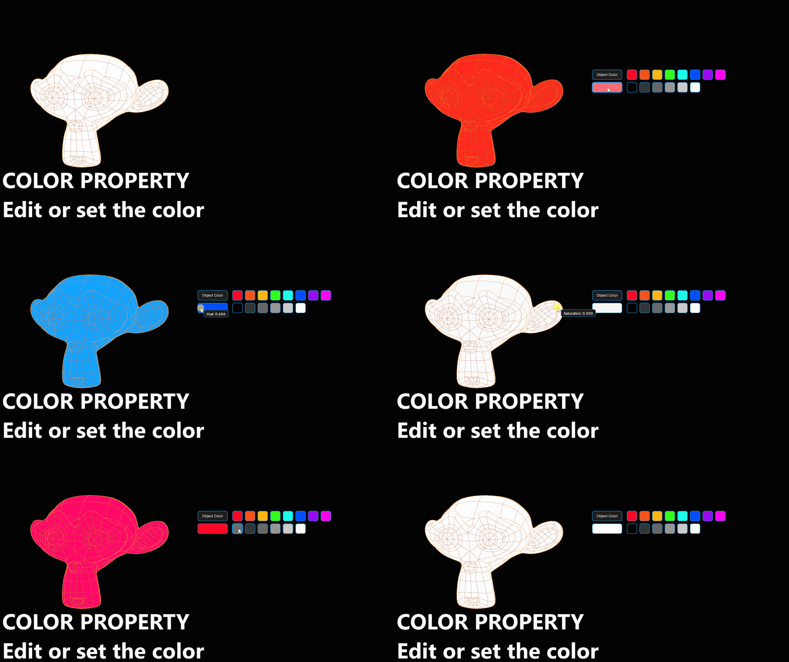
Color buttons — Basic and Set
| Mode | Behavior |
|---|---|
| Basic | the swatch shows the property value; click opens the color picker, drag edits HSV |
| Set | the swatch holds a fixed color and writes it into the property on click |
Several Set swatches sharing one property path make a palette — click to paint with it.
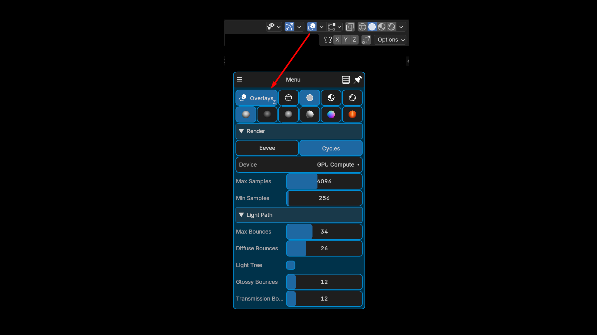
Search Prop and PieMaster variables
A Search Prop button is a field with a filterable dropdown, like Blender's own prop_search. Type in the open dropdown to narrow the list, Enter takes the first match.
It lists any Blender collection — collections, objects, materials, vertex groups, bones, and many more — as well as PieMaster's own pies, menus, layouts, toggles and variables.
The pick is written either straight into an RNA path (string and pointer properties alike, so modifier.object and friends work) or into a named PieMaster variable, with nothing to register. Variables live in the scene, in the session, or globally next to user_pies.json.
A variable is then read from anywhere:
| Where | How |
|---|---|
| Python button | pm.var('name') |
| Command line, operator argument | {{name}} |
| Property Path of a slider, toggle, enum or color | {{name}} |
| Conditions, dynamic labels, dynamic icons | pm.var('name') |
A Property Path carrying a token is resolved every time it is read, so one slider follows whatever the search field picked:
Close on Click applies to Search Prop as well: Keep Open leaves the menu visible behind its open dropdown.
States
A button that changes label, icon and color based on a condition. Grey "Wireframe" when off, green "Wireframe ON" when active.
Building Menus
Right-click capture
Right-click any button in Blender's interface → PieMaster: Add to Pie. The operator, its properties and its icon are captured automatically.
This works on add-on buttons too, not just native Blender ones. Building a menu takes seconds and zero typing.
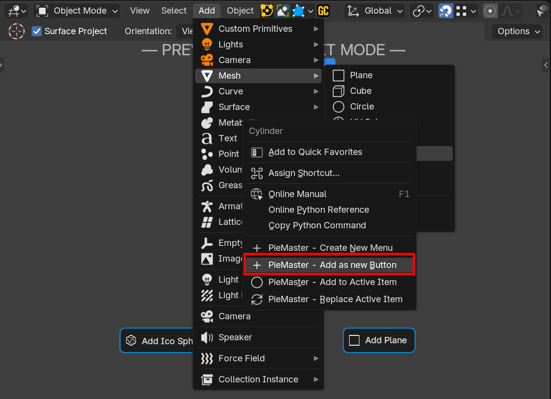
Live Preview and Edit Mode
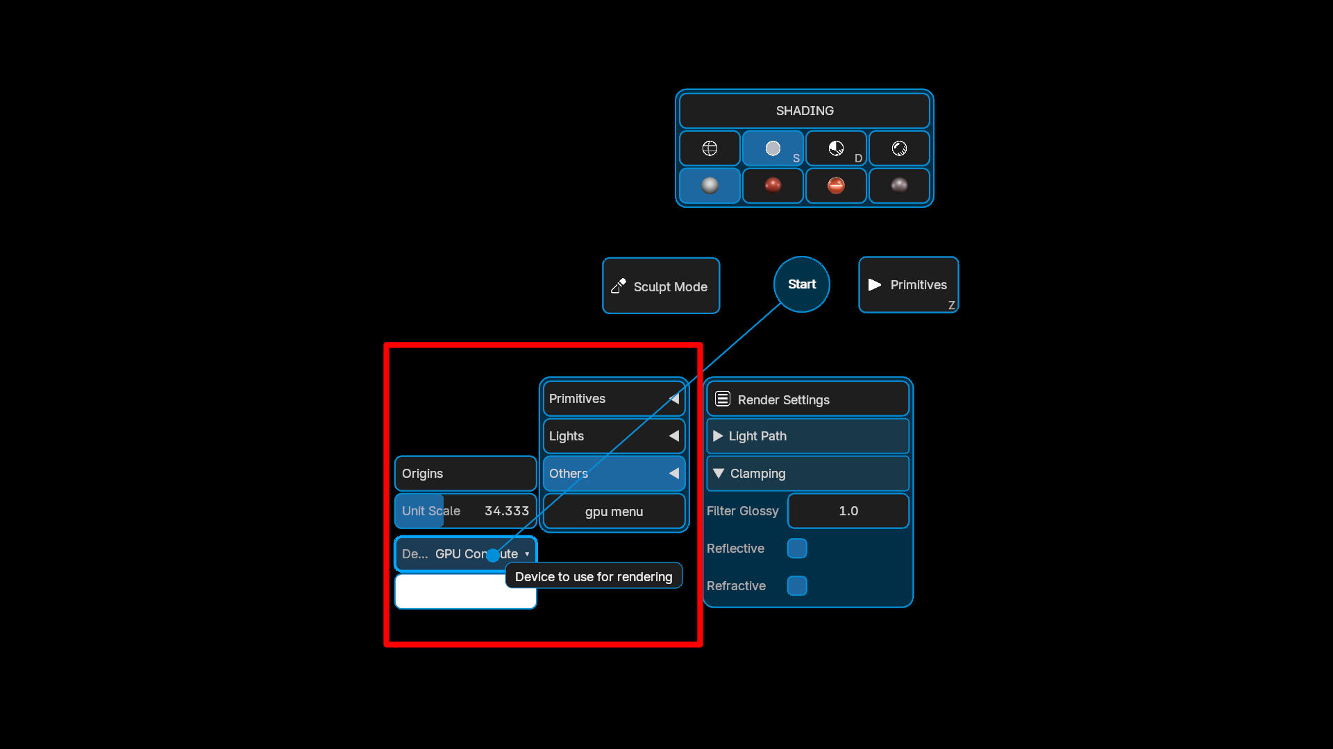
Preview the menu in the viewport while you edit it. Drag buttons to move them, adjust the radius, reorder, resize, snap to a grid, and add buttons directly inside the live menu.
Grid and column settings are edited from the same popup as the button, pie slice zones follow the buttons you move, and the Preview-Edit shortcut is customizable in the keymap settings (it is no longer locked to Ctrl+Shift+RMB).

Sliders, Enums and Color pickers
Real controls, not just action buttons. Drag a slider to change a strength, show an enum as pills or a compact dropdown, drag a color swatch to tune hue, saturation, value and alpha.
Drawers, Sections and GPU dropdowns
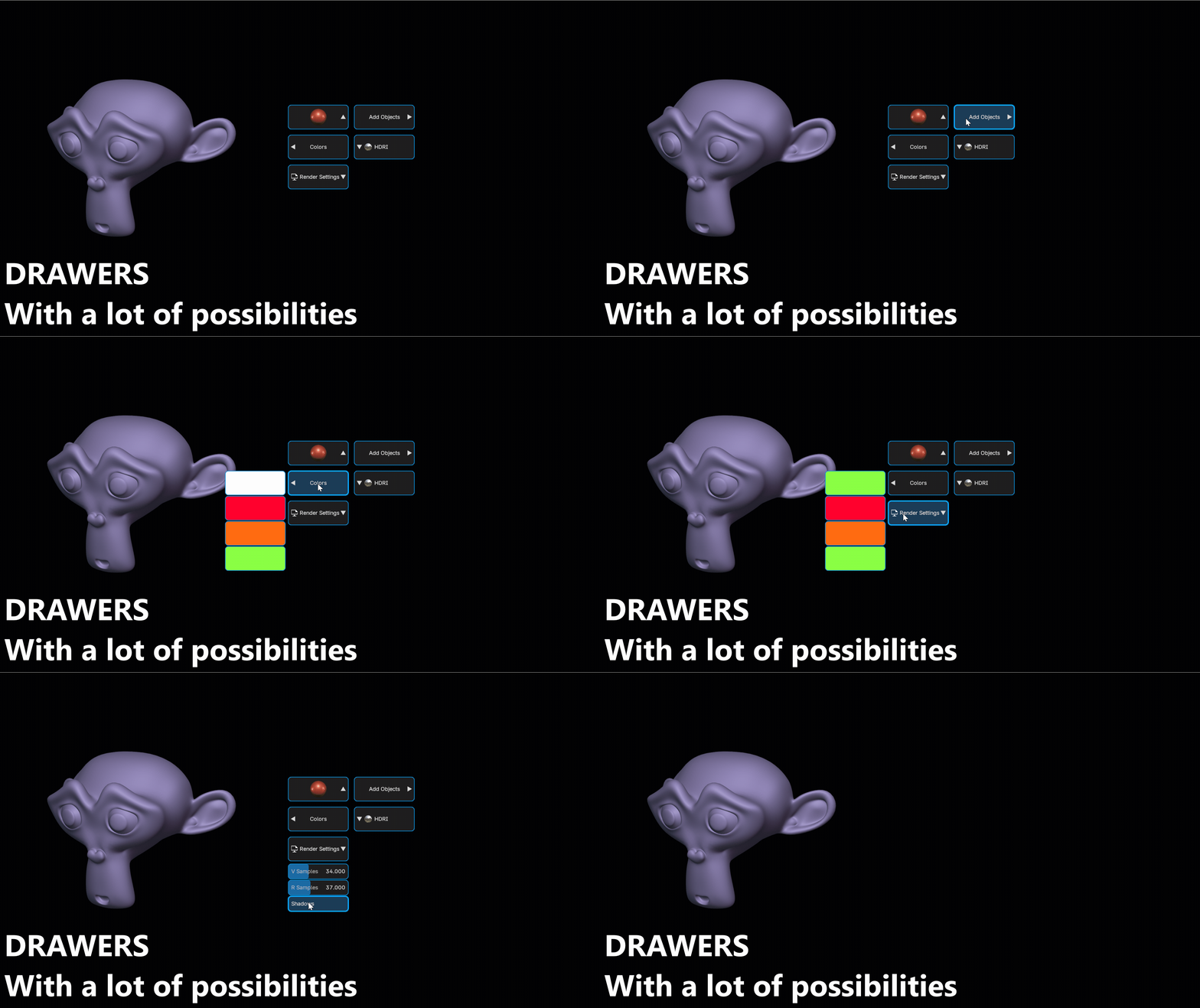
Drawers slide out from the side of the menu on hover, sections collapse, and GPU menus open a compact dropdown list. Pack a lot of tools into a menu without clutter.
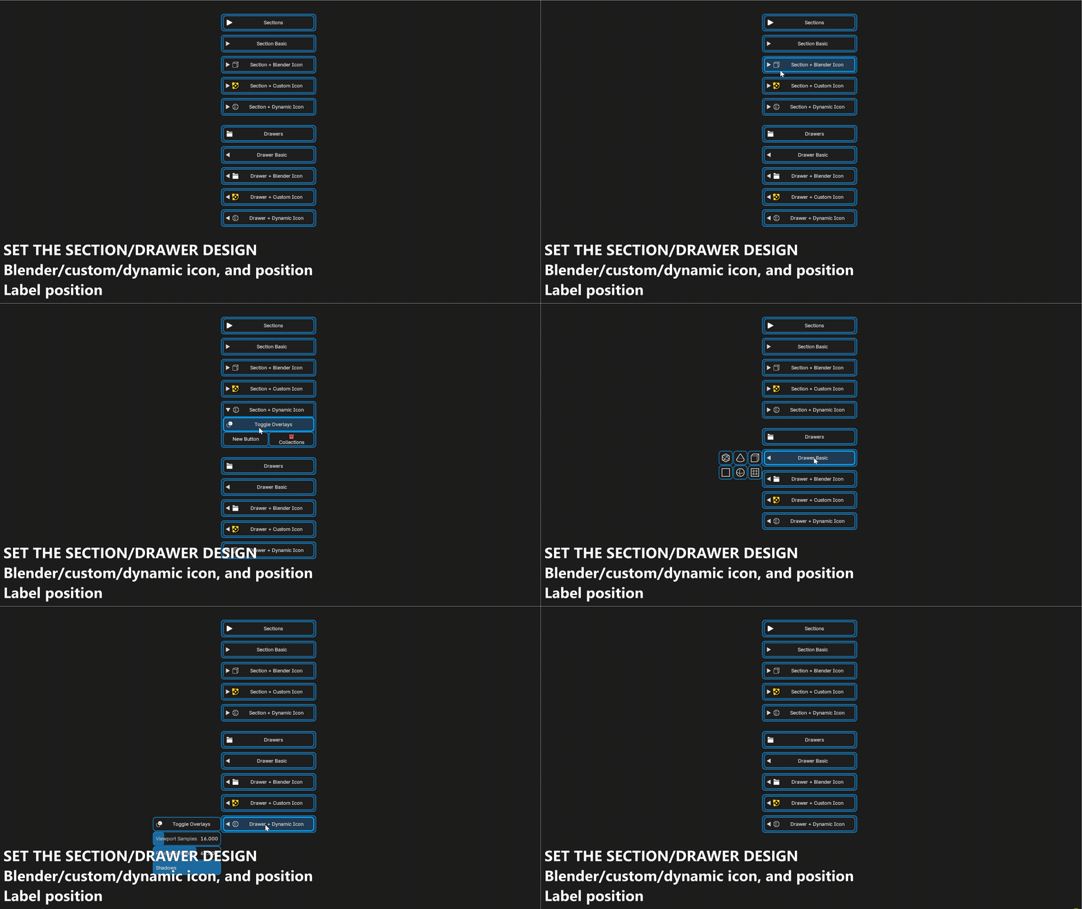
Drawers can be tuned as a block: item width and height for all children at once, rows, icon-only children, arrow on the left, on the right or hidden, and auto-close when an item is picked. Their children support Depress Condition and Toggle Condition like any other button, and dropdown items show their tooltips.
Only one drawer or dropdown is open at a time, and trigger variants (Ctrl+click, drag, …) work on drawers, drawer children and dropdown items.
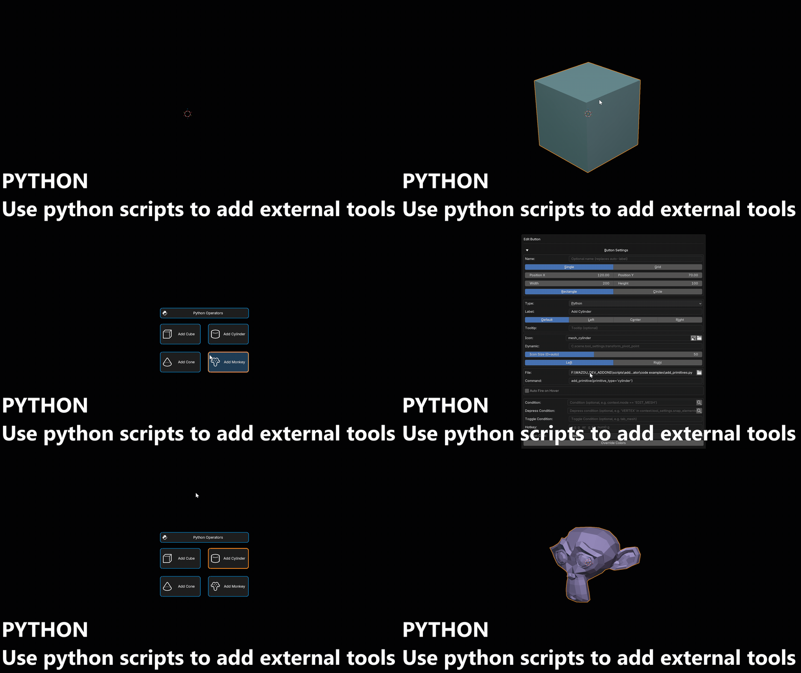
Python buttons
Run an inline expression or a whole .py file from a button — anything Blender can't do with a plain operator.
Macros
Create Macros in one line in an operator type.
#Cube ite 2

bpy.ops.mesh.primitive_cube_add();bpy.ops.object.modifier_add(type='SUBSURF');bpy.context.active_object.modifiers[-1].levels = 2;bpy.context.active_object.modifiers[-1].subdivision_type = 'SIMPLE';bpy.ops.object.modifier_apply(modifier='Subdivision')

#Cube + Bevel Ite 4

bpy.ops.mesh.primitive_cube_add();bpy.ops.object.modifier_add(type='BEVEL'); bpy.context.active_object.modifiers[-1].width = 0.3; bpy.context.active_object.modifiers[-1].segments = 4;bpy.ops.object.shade_smooth();bpy.ops.object.modifier_apply(modifier='Bevel')

#Rounded Cube

bpy.ops.mesh.primitive_cube_add();bpy.ops.object.modifier_add(type='SUBSURF');bpy.context.active_object.modifiers[-1].levels = 2;bpy.ops.object.shade_smooth();bpy.ops.object.modifier_apply(modifier='Subdivision')

#Sphere + Array 2

bpy.ops.mesh.primitive_uv_sphere_add();bpy.ops.object.modifier_add_node_group(asset_library_type='ESSENTIALS', asset_library_identifier="", relative_asset_identifier="nodes/geometry_nodes_essentials.blend/NodeTree/Array");bpy.context.active_object.modifiers[-1].properties.inputs.Socket_5.value = 2;bpy.context.active_object.modifiers[-1].properties.inputs.Socket_21.value[0] = 1.5;bpy.ops.transform.translate(value=(1, 0, 0));bpy.ops.transform.translate(value=(-1, 0, 0))
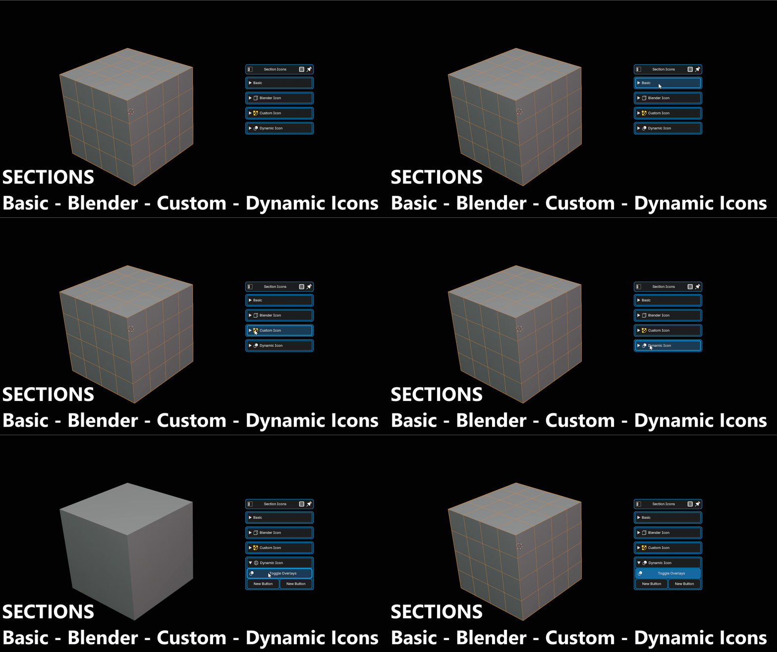
Sections
Create sections to add buttons in them. Add an icon, a custom icon, or a dynamic icon. Same for the Label, it can be dynamic. You can edit the label and icons positions too (Left, Center, or Right).
You can add sections into sections

Drawers
Add items in Drawers and set the flow! With drawers, you can add many types of buttons, and you can arrange them as you want. Change the size and width of the Item, how many per row. Add icons, custom icons, dynamic icons, dynamic label with multilines, etc.
A lot of possibilities
You can also set a drawer as an asset folder library! Change the Item Form to Asset folder, set a path and voilà.
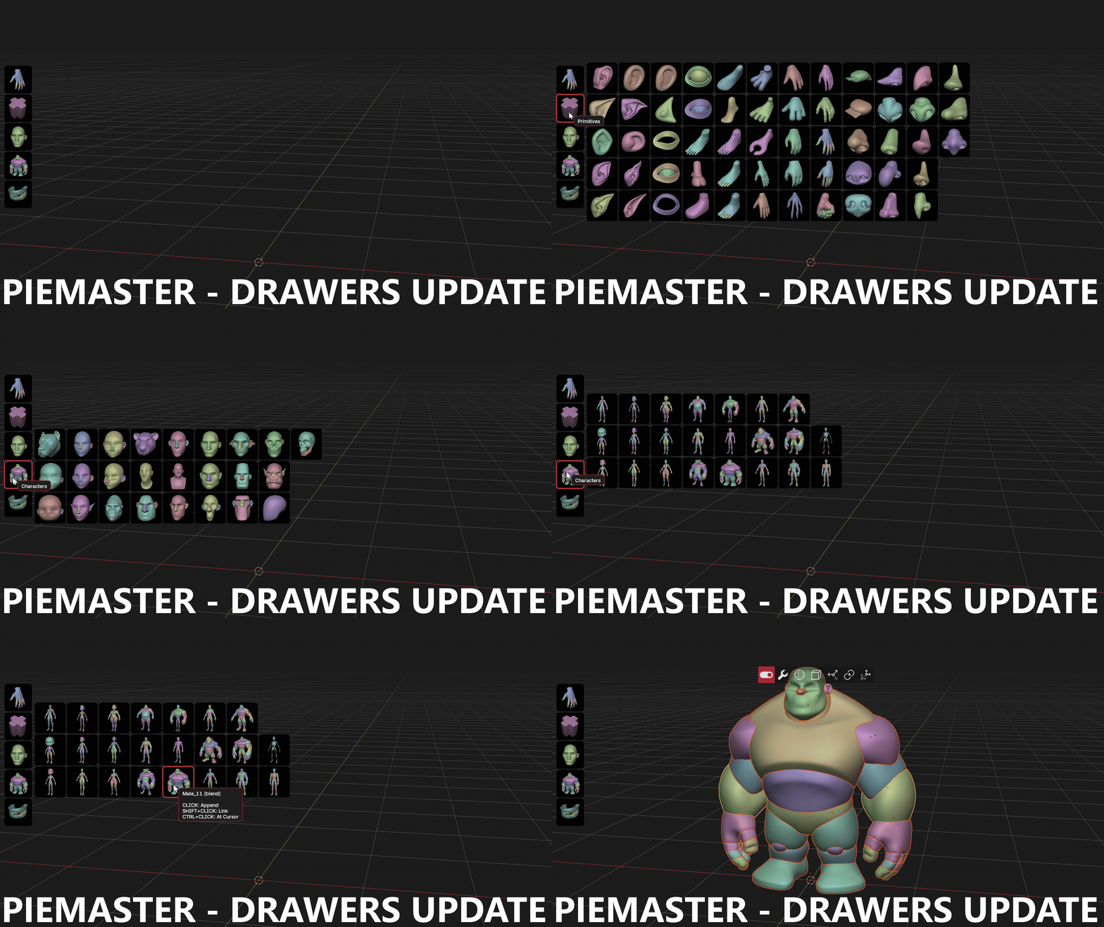
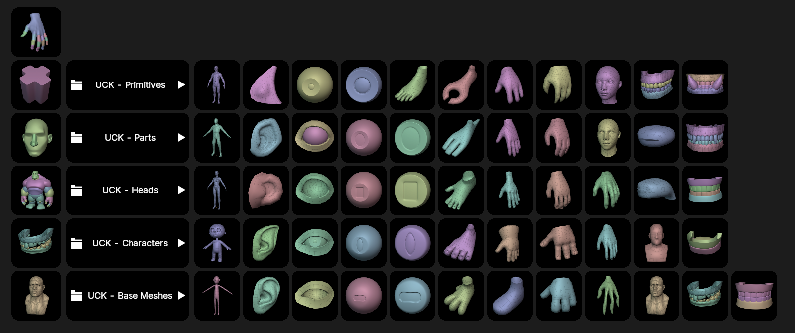
It also support subfolders
Drawers built from the scene
A drawer does not have to be filled by hand. Its Items From setting says where its buttons come from:
| Items From | What fills the drawer |
|---|---|
| Static | the buttons you added yourself |
| Asset Folder | one button per asset file found in a folder, its thumbnail as icon, a click importing it |
| Modifiers | one sub-drawer per modifier on the active object, with its parameters, its visibility toggles and its actions |
| Python | the buttons a function returns, rebuilt from the scene |
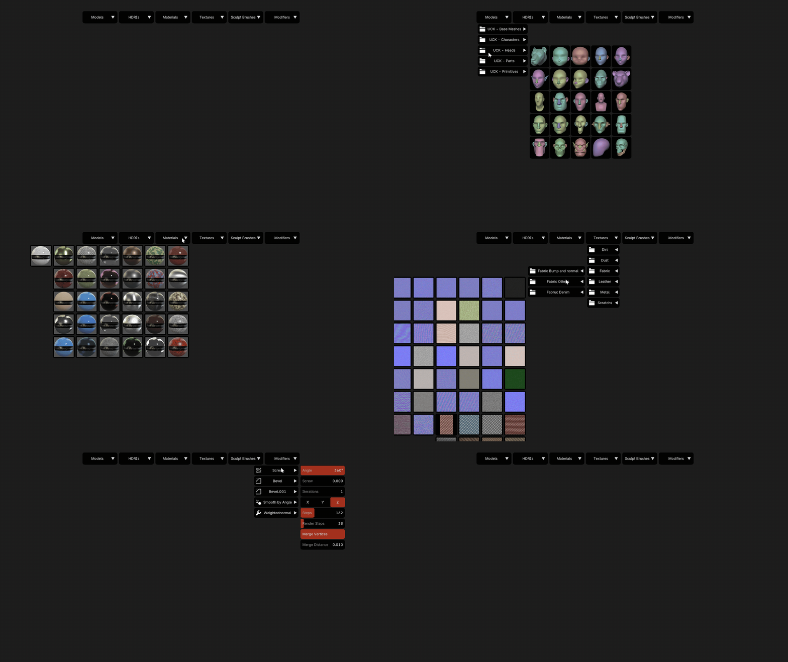
Modifiers — no script to write
Point a drawer at Modifiers and it mirrors the modifier stack of the active object. Each modifier opens its own sub-drawer holding the parameters that matter first, its viewport and render toggles, and its actions.
A modifier type PieMaster has no table for still works: it reads the modifier's RNA and offers the properties it finds — Geometry Nodes inputs included, on Blender 5.x as well, where they moved off the modifier's custom properties.
The sliders behave like Blender's own. A distance takes its drag speed from the size of the object and keeps no maximum where the modifier has none; counts snap to whole numbers, angles to whole degrees, and a distance to a step that follows its range.
Python — build the drawer yourself
Point the drawer at a .py file and the buttons its function returns become the drawer's children, built from whatever the scene holds. Anything a hand-made button can do is available.
Children Layout says how the sub-panels a generator returns open — direction, side flow, flow, items per row — without editing the script. A field left on Keep uses the generator's own value.
Rebuild When is an expression saying when the drawer is worth rebuilding. It is what makes a generated drawer live inside a menu that stays on screen: without one, rebuilding would mean running the generator at frame rate, so the drawer keeps what it had when it opened. A generator declaring PM_SIGNATURE supplies the expression for free — built-in or your own — so a Modifiers drawer follows the active object out of the box, in a LOCKED or Auto Show menu included.
Asset kinds, and what a click does
An asset drawer declares what it holds, and the click follows:
| Asset Kind | Click | Modifier click |
|---|---|---|
| Models | append the object | Shift links it, Ctrl+Shift links it at the 3D cursor |
| Textures | add an Image Texture node under the cursor | Shift+Click replaces the image of the selected node |
| HDRIs | build the whole world node setup, reusing the environment node instead of stacking one per click | — |
| Materials | one tile per material rather than per file, assigned on click | — |
Thumbnails zoom on hover, with a settable delay, and Escape closes the zoom without closing the drawer. Category and folder buttons can be placed where you want them, and the folder paging loops.
Asset Trigger Variants run something after an import — a list played on every tile, subfolders included — so a model can land shaded smooth, at the cursor, or in the right collection without a second click.
Unified Search
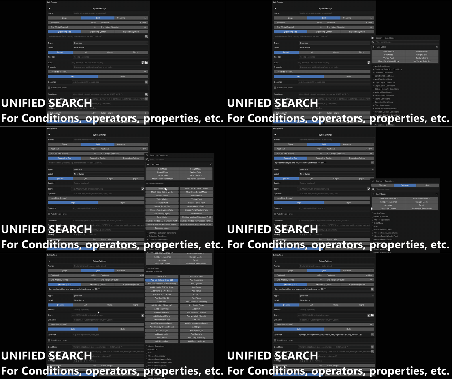
One search popup to find any operator, property or condition without leaving the editor.
It keeps a Last Used list for the buttons you add most often.
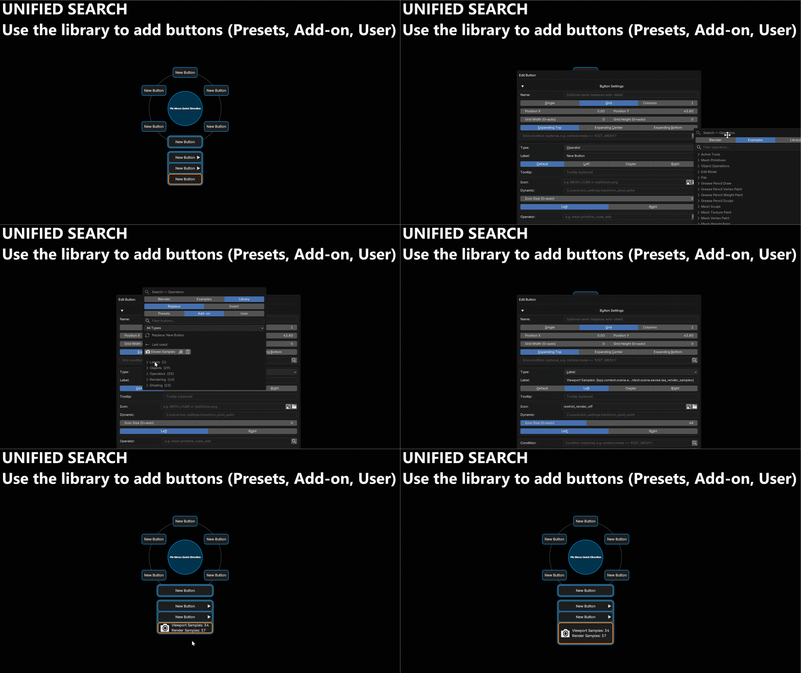
The Library tab can either insert a new button or replace the one you opened it from.
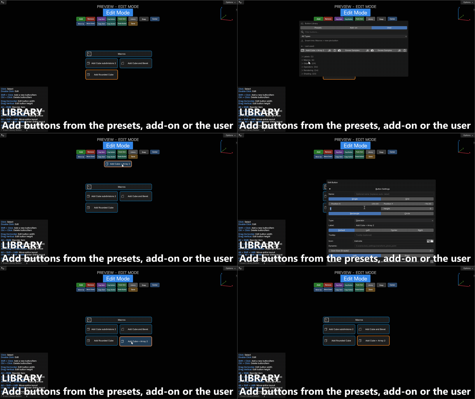
Button Library
Every button of every preset, in one searchable list. Found a good button in another preset? Add it to yours in one click — from Preferences, from Preview-Edit, or from the search popup.
Buttons can also be saved to disk, alone or as a whole pie slot, in your own folder: they survive add-on updates and can be shared as plain files. Icons and Python scripts are bundled next to them automatically.
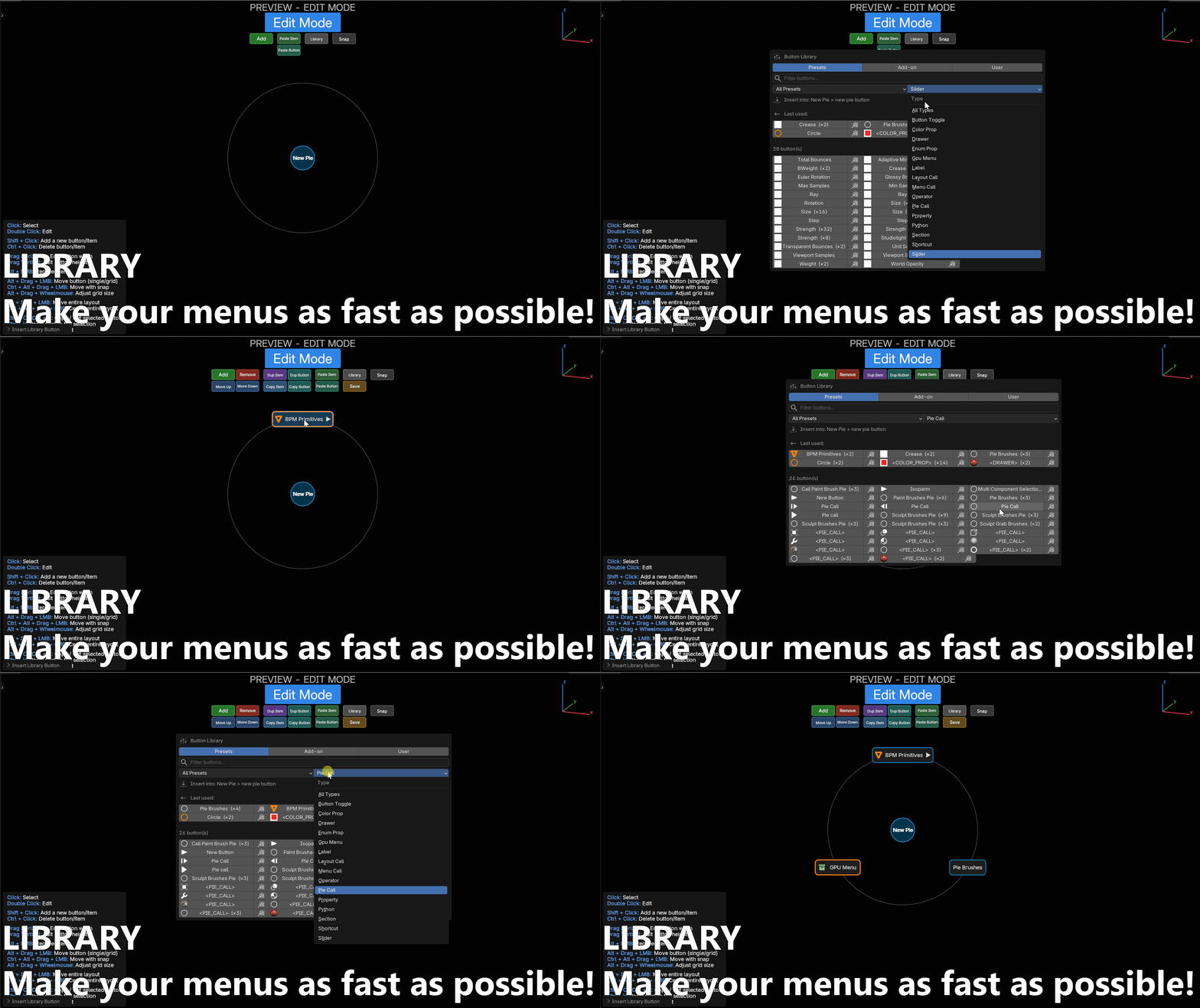
Menu Library
The same thing one level up: browse whole menus from every preset, or from your own saved folder, and add them to the preset you are working on.
Building a new preset becomes assembly rather than typing.
Load Preset
Import a shipped or user preset directly from a list, without going through the file browser.
Folders in the menu list
Group menus into folders to keep a large preset readable. Folders are pure organization — they change nothing in how the menus behave.
One clipboard, everywhere
Copy a button anywhere and paste it anywhere: pie slots, simple menus, layout columns, drawers, nested drawers, GPU dropdowns. Duplicate, Copy and Paste are available at every level.
In Preview-Edit, Ctrl+C / Ctrl+X / Ctrl+V copy, cut and paste the selected button, and Ctrl+Z undoes it — directly in the live menu, without touching the scene's own undo.
Appearance
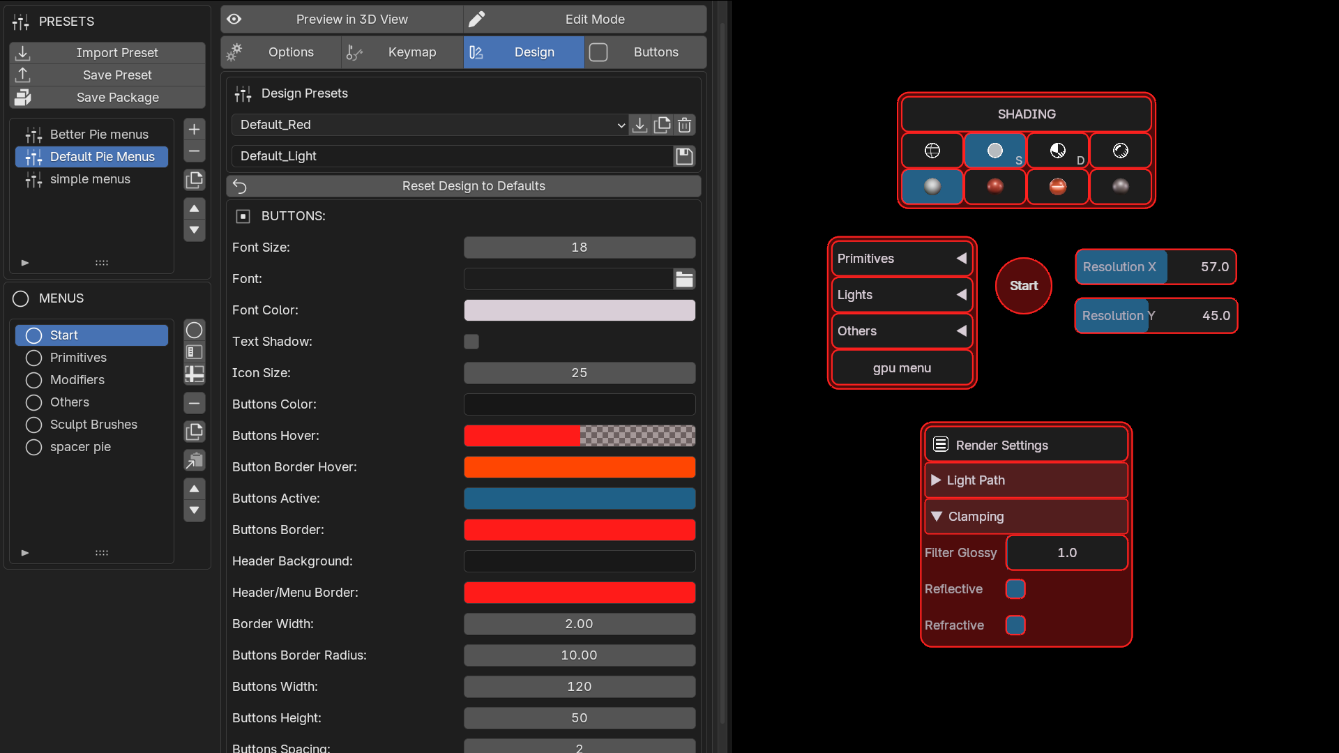
Full Design system
Every color, size, font, border radius, glow, shadow and spacing is customizable, per menu.
- Ready-made themes, plus your own saved design presets
- Global HUE / saturation / value shift to recolor a whole design at once
- Per-menu scale, to adapt an imported preset to your screen
- Blender theme sync, so menus match your active theme
Separators with styles
A separator is no longer only an empty gap. Choose its look: Space, Full line, Centered line, Dotted, or Double dotted, with adjustable thickness, length and color.
Line styles keep the background continuous, so a strip of glued buttons stays one block with a rule drawn across it.
A separator inside a drawer has its own Style block and opens a real gap, cutting the panel background in two rather than being a few invisible pixels wide.
Merge Button Borders
Removes the outline between connected buttons and draws a single contour around the group. For zero-spacing layouts where per-button borders otherwise double up on every seam. The hovered button keeps its own outline, so the highlight still reads.
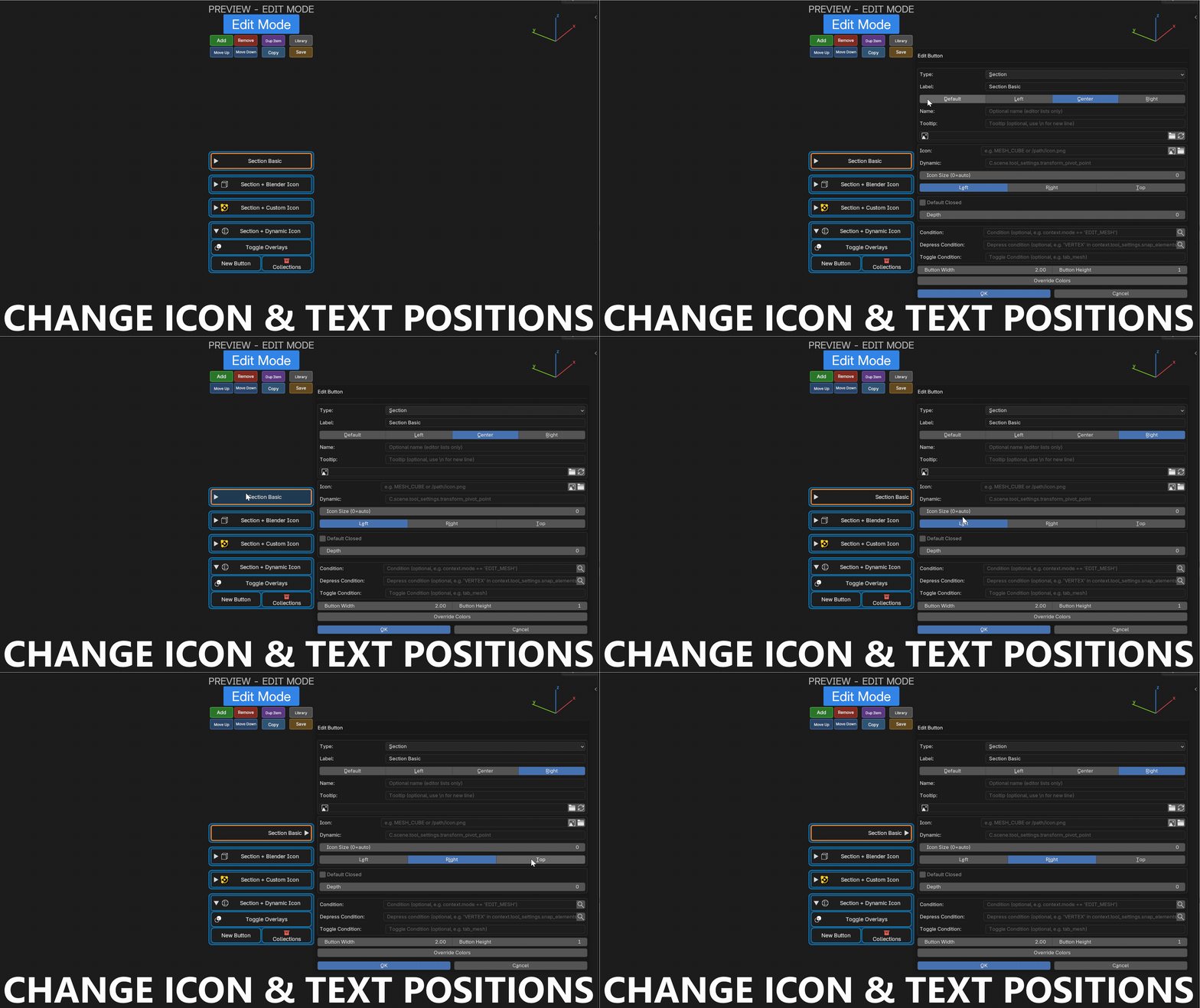
Icon Side and Label Align
Choose which side of the button the icon sits on (left, right or top), and how the label aligns next to it (default, left, center, right). A Pie Call icon can point at the pie it opens; a list of buttons can align its labels like a real menu.
Icon library and custom icons
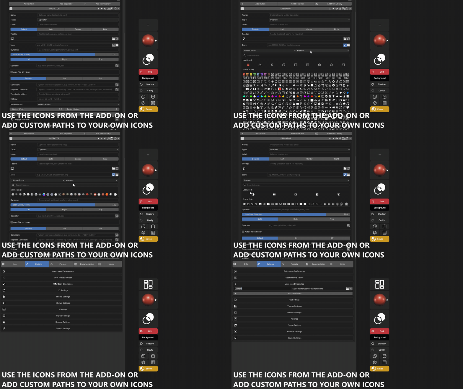
Over 700 bundled icons, plus Blender's own icons, plus your own PNG folders. With search, favorites and recents.
Follow Blender UI Scale
Menus can be scaled along with Blender's own interface, on top of PieMaster's UI Scale.
| Mode | What it follows |
|---|---|
| Off | menus keep the same pixel size whatever Blender is scaled to |
| Resolution Scale | the Interface > Display > Resolution Scale slider only, neutral at 1.0 |
| Full DPI | the scale Blender actually draws its own UI with — the slider combined with the OS display scaling, so menus end up the size of Blender panels |
Menu size and popup sizes
Every menu has its own scale in the Design tab, so an imported preset fits your screen. Grid buttons in pie menus have an adjustable height as well.
The Edit, Capture, Button Library and Search popups have adjustable widths, and the icon grid its own size — the editing UI adapts to your monitor instead of the other way round.
Sounds and bounce animation
Optional hover, click and enter sounds, and a bounce animation on click. Tactile feedback, fully adjustable — or off.
Extras
Pause on center click
Click the center of an open pie to freeze it. It stays open so you can change several settings in a row. Click the center again or press ESC to close.
Object Menus and Auto-Show
Menus that appear on their own next to the selected object, or as soon as a condition becomes true — with no shortcut at all. Contextual UI that shows up when it's relevant and fades when it isn't.
Object menus stay readable at any zoom, follow their object, and Auto Show can be toggled straight from the menu list.
Pin state and last position
Simple and Layout menus remember whether they were pinned and where they were last placed, so a panel you moved once opens where you left it.
Right Mouse behavior
Right Mouse closes an open menu by default, and RMB + drag moves it. If you use RMB for something else, closing on RMB can be disabled — ESC still closes. The native Blender right-click menu keeps working in every mode, Sculpt and Paint included.
Turn a menu or a preset off
The checkbox at the right of a row in the menu or preset list switches it off: its shortcuts, its gestures and its Auto Show are dropped, and it stays editable. A menu you are not sure about is disabled rather than deleted, and a whole preset can be parked without unloading it.
Help Mode
Help Mode, in the UI preferences, puts a small ? next to the options, the button settings and the menu, slot and column settings. Clicking it opens the matching page of this documentation in your browser.
Run Checks and the Trace recorder
The Debug section of the Options tab reports a problem without touching the console.
Run Checks inspects the installation and writes a report: Blender, OS, GPU and add-on versions, the menus and their conditions, the timers and the keymaps — and it flags what is already broken. A condition that raises, a frozen menu, a dead shortcut, a folder that no longer exists, menus whose click areas overlap and which one takes the click, the last buttons used and any run by a menu that does not own them. Menu expressions and drawing cost can be measured too, so flickering and slowdowns have a number rather than a feeling.
The Trace recorder logs what PieMaster runs to a file, line by line and flushed on the spot, so the log survives a crash: start it, reproduce the problem, and the file is on disk even if Blender never comes back.
Presets, import / export, sharing
Group menus into presets, one per project or per workflow. Export as a .json file, or as a .zip bundling your icons and Python scripts, and share a complete menu system with your team in one file.
Everything saves automatically — there is no manual save step.
Next: build your first menu with the Quick Start (5 minutes).